Dial
Most (all?) Domoticz devices can be represented with a dial.
To represent these devices with a dial add type:'dial' to the block definition:
blocks['my thermostat'] = {
  type: 'dial',               //Display as dial
  idx: 123,                   //The Domoticz device id
  title: 'Device name',       //The title of the block as shown in the dial.
  width: 6,                   //The width of the block relative to the column width
}
For the following device types a specific dial representation has been defined:
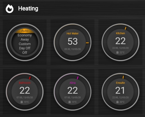
Type = ‘Heating’
Type = ‘P1 Smart Meter’
Type = ‘Temp + Humidity + Baro’
Type = ‘Temp + Humidity’
Type = ‘Thermostat’
Type = ‘Wind’
SubType = ‘Evohome’
SubType = ‘SetPoint’
SubType = ‘Text’
SwitchType = ‘Dimmer
SwitchType = ‘On/Off’
SwitchType = ‘Selector’
For other device types a generic dial will be used.
Block parameters
Parameter |
Description |
|---|---|
idx |
|
title |
'custom_title': Title that will appear on the dialfalse: No title will be showntrue: The device name will be used as title |
type |
|
width |
|
height |
|
backgroundimage |
url or Domoticz text device id containing the url of the background image. See Dial background image |
backgroundsize |
Size of the background image. See Dial background image
'80%': Scale the image to 80% of the dial size'cover': Scale the image so that the image completely covers the dial'contain': Scale the background image so that the image is contained within the dial |
backgroundopacity |
Sets the opacity of the background image. See Dial background image
1 (=default): Opacity of 100%20%: Opacity of 20% |
color |
|
last_update |
|
flash |
|
delay |
|
dialimage |
|
dialicon |
|
iconSwitch |
The icon to use for an on/off dial switch.
'fas fa-power-off': Dedault icon'fas fa-volume-up': Show a volume icon |
showring |
|
fixed |
|
inverted |
Invert the value of Up/Down dials. See Up-down dials
false: Default for dimmers and Blinds Invertedtrue: Default for regular Blinds |
min |
|
max |
|
showunit |
|
value |
The name of the device field to show as main value (only for default dials. Default: |
values |
Used to configure the values to be shown below the main dial value. See Dial values) |
animation |
|
switchMode |
The switch mode for on/off dial switches and for dials without device.
'Toggle': Toggle the dial on click (=default for most dials. See next lines for exceptions)'On': Switch On (=default for scenes and Push On switches)'Off': Switch Off (=default for Push Off switches)'Color': On click the color selector popup will open. (Only for RGB switches) |
decimals |
The number of decimals to show for numbers. Default is 1. For humidity, barometer it’s 0.
1: Numbers will be shown with one decimal |
setpointfirst |
For an updown dial consisting of a setpoint (Thermostat) and temp device, you can set which number will be shown first.
false (=default) : Temperature will be shown firsttrue: Setpoint will be shown first |
showvalue |
true (=default). Show the main device value.false: Don’t show the main device value. |
splitdial |
Normally the dial ring color will color from the 0 value to the actual value, which can be positive or negative. Set this parameter to false to start coloring the dial ring from the minimum value, also for a negative minimum value. |
steps |
Step size for needle adjustment or up/down adjustment (Up/down dials). You can use this parameter to set thermostat steps to 0.5
0.5: Use step size of 0.5 |
styleStatus |
Show colored outer ring if status is ‘On’ (blinds, dimmers)
true (=default for dimmers). Show colored outer ring if device status is ‘On’false (=default for blinds): Don’t color the outside ring |
subtype |
For certain dial types you can specify a subtype for a specific layout/format
'windspeed': For wind devices, to show wind speed instead of wind direction as needle position'windgust': For wind devices, to show wind gust instead of wind direction as needle position'updown': For thermostat and blind devices, to render the dial with up and down buttons. See Up-down dials'usage': For p1smartmeter and energy devices, to show actual Usage instead of CounterToday values. See Energy |
sortOrder |
Set sort order for selection switches
0: No sorting (default)1: Ascending sort order-1: Descending sort order |
unit |
The text to put behind the main value |
Usage
Dimmer
You can use the dial just like a dimmer slider. Click on the dial to switch the dimmer on/off.
blocks["bathroom_lights"] = {
    idx: 439,
    title: "Bathroom",
    type: "dial",
    color: "#57c4d6",
    width: 2,
}
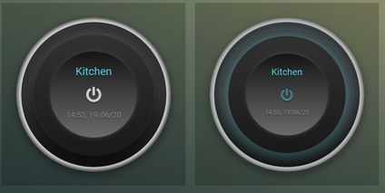
On/Off Switch
Any devices with this switchtype and type: ‘dial’ will automatically render as a dial button.
blocks['kitchen_lights'] = {
    idx: 451,
    title: 'Kitchen',
    type: 'dial',
    color: '#57c4d6',
    width: 2
}
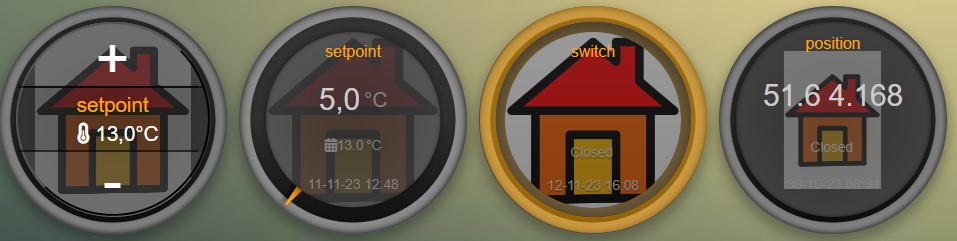
Blinds
All four Domoticz blinds types can be rendered as dial:
Blinds
Blinds Percentage
Blinds Inverted
Blinds Inverted Percentage
The text in the up and down buttons can be configured via the block parameters textOpen and textClose respectively.
For Blinds Percentage, if you press the Up or Down button, a command is send to Domoticz to update the blinds position.
Pressing these buttons several times in a row may give unpredictable results, because the dial is being rerendered as soon as Domoticz notices the blinds position has been changed.
To prevent this, the dial will only be updated after a certain delay after the last command has been sent to Domoticz.
This delay value can be configured via the delay block parameter. Only applicable to Blinds Percentage devices. The default value is 2 (seconds).
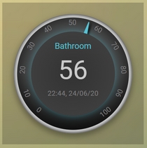
Temp + Humidity
Will display temperature as the main value and humidity as extra info below. There is enough room to display last_update with this dial.
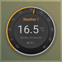
blocks['temp_hum'] = {
    idx: 435,
    title: 'Weather 1',
    type: 'dial',
    setpoint: 15,  // this value will be used to control the color of the outer ring, e.g. < 15 is blue, >= 15 is orange
    min: -10, // set the minimum value for the dial range (default is 5)
    max: 40, // set the maximum value for the dial range (default is 35)
    width: 2,
    shownumbers: true,  // display the numbers on the dial (default is false)
    showring: true, // display outer ring color all the time (default is false, will only display when hover over)
    showunit: true // display unit for the dial value (default is false)
}
Temp + Humidity + Baro
Similar to above, but with Baro as extra info too. Last_update can be added but it is a tight fit.
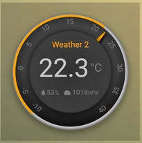
blocks['temp_hum_baro'] = {
    idx: 72,
    title: 'Weather 2',
    type: 'dial',
    setpoint: 15,
    min: -10,
    max: 40,
    width: 2,
    /* dialicon: ['fas fa-thermometer-half', 'fas fa-arrow-down'], */   // dial icons array when for dials have more than 1 extra info
    /* dialimage: ['volumio.png', 'air.png'],  */   // dial images array when for dials have more than 1 extra info
    showunit: true,
    shownumbers: true,
    last_update: false  // disabling last update to allow for more room
}
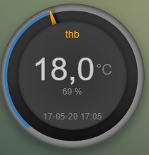
Wind
This dial has a 360 degree range (like a compass). The wind direction can be set to point to where the wind is blowing from or to, by using the new “offset” parameter. Below I have set the dial to point to which direction the wind is blowing.
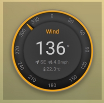
blocks['wind'] = {
    idx: 73,
    title: 'Wind',
    type: 'dial',
    setpoint: 18, // the entire outer ring will change color based on this setpoint, factoring in the current temperature (default 15)
    offset: 180,  // 0 will point to the wind source, 180 will point to wind direction (default is 0)
    width: 2,
    showring: true,
    showunit: true,
    shownumbers: true,
    last_update: false
}
In case you want to use the wind speed as needle position instead of the wind direction, add the following block parameter:
subtype: 'windspeed'
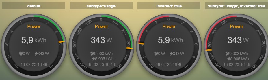
P1 Smart Meter
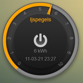
A P1 Smart Meter will show the total energy usage of today which is the difference between energy usage and energy delivery. Unlike most dials, zero is at “12 o’clock”, instead of the tradional dial which starts at “7 o’clock”.
For P1 Smart Meter you can use some additional block parameters.
To show actual power usage, add subtype: 'usage' to the block definition.
To invert plus and minus, add inverted: true to the block definition.
In total this gives 4 variants, which are displayed below:
You can also set the min and max parameter.
blocks['p1'] = {
    idx: 454,
    type: 'dial',
    subtype: 'usage',  //to show actual power usage instead of daily energy counter
    inverted: true     //Value is positive if energy leaving the house is higher than energy consumption
}
Show multiple values of a P1 meter
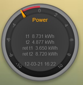
blocks['p1counters'] = {
  type: 'dial',
  idx: 43,
  values: [
    {
      value: 'Data0',
      unit: 'kWh',
      label: 't1',
      scale: 0.001
    },
    {
      value: 'Data1',
      unit: 'kWh',
      label: 't2',
      scale: 0.001
    },
    {
      value: 'Data2',
      unit: 'kWh',
      label: 'ret t1',
      scale: 0.001
    },
    {
      value: 'Data3',
      unit: 'kWh',
      label: 'ret t2',
      scale: 0.001
    },
    ],
  showvalue: false,
  animation: false,
  shownumbers: true,
  fixed: true,
  width: 6
};
Energy
A energy device will show the total energy usage of today.
For energy devices you can use some additional block parameters.
To show actual power usage instead of daily energy uses, add subtype: 'usage' to the block definition.
To display the values as negative values add inverted: true to the block definition.
In this situation the dial will be changed into a split dial (with 0 at top) as well.
In total this gives 4 variants, which are displayed below:
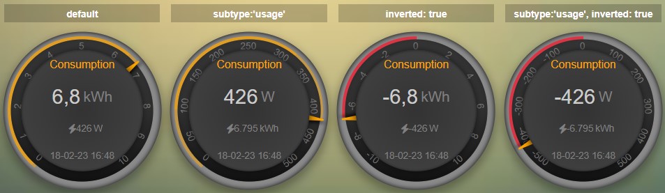
You can also set the min and max parameter.
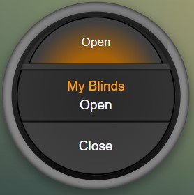
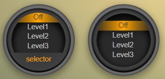
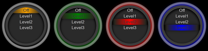
Selector switch
Selector switches will be displayed as a menu. The dial menu can be shown with or without (=default) title.
  blocks['dm'] = {
    idx: 9,
    type: 'dial',
    title: true,
    width:6,
}

blocks['dm-notitle'] = {
    idx: 9,
    type: 'dial',
    width:6,
}
You can define the sort order of the selector options via the block parameter sortOrder.
0: No sorting1: Ascending-1: Descending
Toon Thermostat
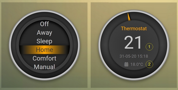
“SwitchType”: “Selector”
blocks['toon_controller'] = {
    idx: 419,
    title: 'Toon Controller',
    type: 'dial',
   width: 3,
}
1 = “Type”: “Temp”, 2 = “Type”: “Thermostat”
blocks['toon_thermostat_temp'] = {
    idx: '421',   // -> 2
    title: 'Thermostat',
    type: 'dial',
    temp: 420,   // -> 1
    width: 3,
}
Up-down dials
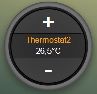
You can render a Thermostat as a dial with up-down buttons by setting subtype to updown:
blocks['thermupdown'] = {
    type: 'dial',
    subtype: 'updown',
    idx: 15,
}
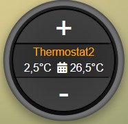
You can add the temperature info from another device as well:
blocks['thermtempupdown'] = {
  type: 'dial',
  subtype: 'updown',
  idx: 15,
  temp: 36  //Use device 36 as actual temperature sensor
}
Light dimmers and Blinds can be rendered as up-down dials as well.
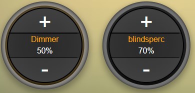
For Light dimmers the middle button will work as on-off switch.
For Blinds the middle button will work as stop button.
With the inverted block parameter you can invert the values: 10% will become 90%, 70% will become 30%, etc.
I prefer that for an Up Down blinds dial the Up-button will open the blinds. The blinds percentage goes from 0% (fully closed) to 100% (fully open).
This conflicts with the defaults in Domoticz where 0 is open, and 100 is closed.
For this reason the ‘inverted’ block parameter by default is set to true for regular Domoticz blinds devices, and set to false for Domoticz Blinds Inverted devices.
By setting the steps parameter you can adjust the step size. For Thermostats the default step value is 0.5. For Dimmers and Blinds the default step value is 10 (%).
Dial values
(Not applicable to blinds dials and up-down dials)
Each dial has a main value shown in the middle of the dial.
The values to be shown below the main dial value can be selected via the values parameters as follows:
blocks[16] = {
    type:'dial',
    values:['Humidity'],
    showunit: true
}
Assuming that device 16 is a TempHumBar device then with the above block definition the temperature will be shown (main value) and the humidity as additional value.
If needed you can customize the value units by adapting the values array as follows:
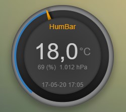
blocks[16] = {
    type:'dial',
    title:'HumBar',
    values: [
        {
            value:'Humidity',
            unit:'(%)',
        },
        {
            value:'Barometer',
            unit:'hPa',
        },
    ],
}
It’s possible to combine data from several devices:
blocks['mytherm'] = {
    type: 'dial',
    idx: 19,
    temp: 16,
    min: 5,
    max: 30,
    values : [
        {
            idx: 10,
            label: 'distance',
            icon: 'fas fa-cloud',
            unit: 'km'
        },
        {
            label:'setpoint',
            idx: 19,
            unit: 'C'
        },
    ]
}
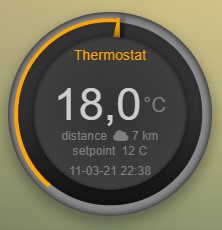
In this example the main device is device 25, which is a Thermostat device. The temperature value of device 27 is displayed, because the temp parameter is set to 25.
Below the temperature two additional values will be displayed. As you can see you can add a label text as well.
To combine two text devices into one dial use the following:
blocks['combinedtext'] = {
    type: 'dial',
    idx: 15,
    values : [
        {
            idx: 16,
        },
    ]
}
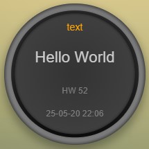
With 15 and 16 two Domoticz Text devices.
And some more tricks:
blocks['combi'] = {
    type: 'dial',
    idx: 18,
    showvalue: false,
    values : [
        {
            idx: 52,
        },
        {
            idx: 16,
            value: 'Temp',
            label:'outside: ',
            unit: 'gr C',
            addClass:'w100'
        }
    ]
}
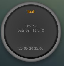
The base type of this block is a text block, because device 18 is text device. However, the value of this device is not shown,
because the parameter showvalue is set to false.
Device 52 is a text device. The value is shown. Also the temperature of device 16 is displayed, with a custom label and unit. By adding ‘w100’ as utility class, this value is shown on a new line, instead on the same line as the other device.
By default, the ‘Data’ field of a device will be used as value. You can overrule this by setting the value parameter in the values object as shown before.
For text devices, the value will be interpreted as text instead of a number. For other devices you can add type: 'text' to the value object to enforce that the value will be handled as text as well.
Multiple values
You can add multiple values to most dial types. Or, add a needle representing the value of another device to for instance a dial switch:
blocks['sw1'] = {
  idx: 1056,
  type:'dial',
  values: [
    {
      idx: 1057,
      isNeedle: true
    },
  ],
  width: 6,
  showring: true,
  shownumbers: true,
  min: 0,
  max: 10
}
Value parameters
You can use the following parameters within the values definition of the dial:
Parameter |
Description |
|---|---|
label |
Text to add in front of the value |
icon |
Name of the FontAwesome icon to place between label and value
'fas fa-car' |
image |
Image to place between label and value (it will replace icon if defined)
'image.jpg' |
value |
Name of the Domoticz device field to use as value |
decimals |
Number of decimals to use while formatting the value (default: 0) |
scale |
Multiplication factor for the value (default: 1) |
type |
Set to |
unit |
Text to add behind the value. |
addClass |
Name of the CSS class to add to this item. |
isSetpoint |
Handle this device/value as a setpoint device. You can adjust the device by rotating the needle. |
isNeedle |
The needle will follow the value of this device. It’s read-only. |
The following CSS classes are used:
.extra: All value items
.item: One value item.
.itemlabel: The label part of an item
.dataunit: The combination of value and unit
.data: The value part of an item
.unit: The unit part of an item
The addClass parameter is applied on item level.
Dial background image
Via the backgroundimage parameter the url of a background image can be defined.
Instead of an url you can also fill in a Domoticz text device id.
This Domoticz text device should then contain the url pointing to the image to be used as background for the dial.
The size can be adjusted via the backgroundsize parameter, and the opacity can be set via the backgroundopacity parameter.
Example:
blocks['dialtext'] = {
    idx: 179,
    type: 'dial',
//    backgroundimage: './img/curtainclosed.png'
    backgroundimage: 182,
    backgroundsize: '50%',
    backgroundopacity: 0.3,
}
In the example above Domoticz device 182 is used to obtain the url of the background image.
Example how to set the content of a Domoticz text device:
http://domoticz:8080/json.htm?type=command¶m=udevice&idx=182&nvalue=0&svalue=https://www.schoolplaten.com/afbeelding-huis-dl28257.jpg
Custom Styling
In Domoticz you can hide the Off level of a Selector Switch. In Dashticz you can hide the Off level by adding the following code to your custom.css:
[data-id='<block_name>'] .dial-menu li:nth-child(1){
    display: none;
}
To change the grey dial bezel color from grey to red:
.dt_content .dial {
    background-color: #bb2424 !important;
}
To change the outer ring primary color from orange (default) to yellow:
.slice.primary {
    color: #d9e900;
}
To change the outer ring secondary color from blue (default) to lime green:
.slice.secondary {
    color: #26e500;
}
Split dials (dials which may have negative values) will receive the negative and positive class as well.
In case you’ve redefined the primary or secondary styling in custom.css, then you have to update the positive/negative styling as well:
.slice.positive {
    color: red !important;
}

.slice.negative {
    color: blue !important;
}
To change the dial needle color from orange (default) to lime green:
.dial-needle::before {
    border-bottom-color: lime !important;
}
To target just one dial, you can prefix the above code snippets with block id of the dial, for example:
[data-id='temp_hum_baro'] .dial-needle::before {
    border-bottom-color: lime p!important;
}
Change the size of the dial-center:
.dial-center {
    height: 65%!important;
    width: 65%!important;
}
Hide extra data:
.dial[data-id='dial_name'] .extra {
    display: none;
}
Vertical center the dial menu:
.dial-menu .status {
        justify-content: center;
        display: flex;
        flex-direction: column;
}

.dial-menu .status li {
        margin: unset
}
Change the font of the dial menu text:
.dial-menu .status li {
    font-size: 75%
}
To change the colors of the blinds buttons:
.dialbtn.up {
  background-color: darkgreen;
}
.dialbtn.middle {
  background-color: darkblue;
}
.dialbtn.down {
  background-color: darkred;
}
And for the selected buttons:
/*Next block is the default styling*/
.dialbtn.selected {
  background-image: radial-gradient(rgba(255,255,255,0.5), rgba(0,0,0,0));
}

.dialbtn.up.selected {
  background-color: lightgreen;
}

.dialbtn.up.selected {
  background-color: lightred;
}
To change the text size in the up and down buttons of a blinds dial
.up .text, .down .text {
  font-size: 200%
}
Examples
Multicolor Selector Switch
CONFIG.js:
blocks['selector_switch'] = {
  idx: 123,
  type: 'dial',
  width: 5,
}

columns[1] = {}
columns[1]['blocks'] = ['selector_switch']
columns[1]['width'] = 5;
custom.js:
function deviceHook(device) {
  if (device.idx==123) {
    var level=parseInt(device.Level);
    device.deviceStatus='level'+level
  }
}
custom.css:
/*ring color*/
.level10 .dial-center {
  box-shadow: 0 0 25px 1px green !important;
}

/*selected item color*/
.level10 .status {
  --dial-color: green !important
}

/*ring color*/
.level20 .dial-center {
  box-shadow: 0 0 25px 1px red !important;
}

/*selected item color*/
.level20 .status {
  --dial-color: red !important
}

/*ring color*/
.level30 .dial-center {
  box-shadow: 0 0 25px 1px blue !important;
}

/*selected item color*/
.level30 .status {
  --dial-color: blue !important
}
Windspeed
CONFIG.js:
blocks['wind'] = {
        idx: 2442,
        title: 'knopen',
        type: 'dial',
        color: '#57c4d6',
        values: [
                {
                value: 'Speed',
                addClass: 'bigwind',
                decimals: 0,
                }
        ],
        setpoint: 18, // the entire outer ring will change color based on this s
        offset: 0,  // 0 will point to the wind source, 180 will point to wind d
        showvalue: false,
        width: 12,
        showring: true,
        showunit: true,
        shownumbers: true,
        last_update: false
}
custom.css:
.dial-center {
        height: 65%!important;width: 65%!important;
}
[data-id='wind'] .dial-needle::before {
        border-bottom-color: red!important;
}
.bigwind {
        font-size: 300% !important;
        color: white !important;
        height: 40px !important;
}
Hide the additional data
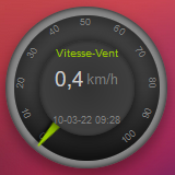
You can set the values parameter to an empty array to hide the additional data, like this:
CONFIG.js:
blocks['windspeed'] = {
        idx: 39,
        title: 'Vitesse-vent',
        type: 'dial',
        subtype: 'windspeed',
        values:[]
}