Domoticz blocks
Several types of Domoticz blocks can be defined:
Devices
Scenes
Groups
Variables
Texts
Devices
Almost all Domoticz devices can be shown on the Dashticz dashboard. Before you can use a device in a column you must make it known in your CONFIG.js as follows:
blocks = {}        //only once
blocks[123] = {
 title: 'My device',
 width: 12
}
If you use anything other than a number you have to put it between quotes: ['s1'] ['v3'] ['123_1']
The number 123 is the Domoticz device id. The example above also shows the use of two parameters: title and width.
For a full list of parameters see Block parameters.
For most devices containing a value, like temperature, power, etc, it’s possible to show the data as a graph. See Graphs.
You can also use custom names for the block identfier. In that case you have to add the idx parameter to indicate which Domoticz device you want to use:
blocks['my device'] = {
   idx: 123
}
Grouped devices
To use grouped devices in a column you must make it known in your CONFIG.js as follows:
blocks['lights'] = {
   blocks: [
   'light_livingroom',
   'light_kitchen',
   'light_bathroom'
   ]
}
Now you can add all 3 light blocks to a column with the following code:
columns[1] = {}
   columns[1]['blocks'] = [
   'lights'
]
All the blocks within such a group can be styled in custom.css all at once:
[data-id='lights'] .title {
   color: yellow
}
Scenes and Groups
To select a Domoticz Group or Scene add ‘s’ in front of the Scene/Group ID.
Example:
blocks['s12'] = {    //Select group/scene with Domoticz index 12
  title: 'My group 12'
}
Variables
To select a Domoticz variable add ‘v’ in front of the Domoticz variable ID.
Example:
blocks['v3'] = {    //Select variable with Domoticz index 3
  title: 'My variable 3'
}
After that you can use 'v3' in your column definitions in CONFIG.js as usual.
A list of all Domoticz variables can be obtained via:
http://[DomoticzIP:Port]/json.htm?type=command¶m=getuservariables
Block parameters
Parameter |
Description |
|---|---|
width |
|
title |
|
idx |
Index of the Domoticz device id, group/scene id, or variable id you want to use.
<idx> or '<idx>': Device idx to use'<idx>_<subidx>': To select subdevice from Domoticz device, like temperature/humidity.'s<idx>': Select group or scene with id <idx>'v<idx>': Select variable with id <idx> |
icon |
Defines alternative icon of the device instead of the default, choose from: https://fontawesome.com/icons?d=gallery&m=free
'fas fa-eye' |
image |
If you want to show an image instead of an icon, place image in
img/ folder'bulb_off.png' |
iconOn |
Icon to show in case the device state is on.
'fas fa-eye' |
iconOff |
Icon to show in case the device state is off.
'fas fa-eye' |
imageOn |
Image to show in case the device state is on. Place image in
img/ folder'bulb_off.png' |
imageOff |
Image to show in case the device state is off. Place image in
img/ folder'bulb_off.png' |
textOn |
Text to display in case the device is on. |
textOff |
Text to display in case the device is off. |
switch |
true Switch title and datafalse (default) |
hide_data |
true Don’t show datafalse (default) Show data field |
last_update |
true (default) Show the time when this block was updated for the last timefalse Don’t show the last update time for this block |
flash |
Controls the flashing of the block when it’s value changes.
0 : No flashing (=default)1..1000 : Duration (in ms) of the flashing effect |
hide_stop |
true Hide stop button for applicable devices, like blindsfalse (Default) Show stop button |
playsound |
Play a sound when a device changes
'sounds/ping.mp3' |
playsoundOn |
Play a sound when a device changes to On
'sounds/ping.mp3' |
playsoundOff |
Play a sound when a device changes to Off
'sounds/ping.mp3' |
speak |
Speaks text when a device changes
'Device status has changed' |
speakOn |
Speaks text when a device changes to on
'Device is on' |
speakOff |
Speaks text when a device changes to off
'Device is off' |
protected |
true Protect switching manually in Dashticz (not in Domoticz)false (Default) Switch state can be changed in Dashticz |
confirmation |
0 No confirmation (default)1 Dashticz asks the user for confirmation before changing a switch-device |
password |
Password protect switches, buttons, thermostats, sliders, blinds
'secret': Password to use |
gotoslide |
Goto screen when a device changes
1 .. 99 |
gotoslideOn |
Goto screen when a device changes to on
1 .. 99 |
gotoslideOff |
Goto screen when a device changes to off
1 .. 99 |
popup |
This allows the popup to use all the block parameters that a graph block does, allowing users to style the graph.
popup: 'popup_your_graph' |
graph |
Popup graphs enabled by default for most block types.
graph: false will disable a popup graph. |
openpopup |
Open a popup when a device changes. See Usage of openpopup(On)(Off) |
openpopupOn |
Open a popup when a device changes to on. See Usage of openpopup(On)(Off) |
openpopupOff |
Open a popup when a device changes to off. See Usage of openpopup(On)(Off) |
addClass |
The CSS class name, that will be added to the block.
'myclassname': Define ‘myclassname’ in custom.css |
unit |
String that will be placed behind the device value to indicate the unit.
'kilowatt': The string will replace the default unit. |
url |
|
newwindow |
0: open in current window1: open in new window2: open in new frame (default, to prevent a breaking change in default behavior)3: no new window/frame (for intent handling, api calls). HTTP get request.4: no new window/frame (for intent handling, api calls). HTTP post request. (forcerefresh not supported) |
colorpicker |
Choose the RGB colorpicker for RGB devices. See RGB Color picker
0: No RGB colorpicker1: Old style RGB colorpicker2: New style RGB colorpicker |
colorpickerscale |
Sets the relative size of the colorpicker 2 popup window. See RGB Color picker
1 (=default): Scaling is 100%1.5: Set scaling to 150% |
mode |
Parameter for specific functionality
1: Set mode: 1 for Hue RGBWW devices having colorpicker: 2 |
batteryThreshold |
If the battery level is below
batteryThreshold then a battery icon will be displayed. See Battery levelDefault value is defined by config[‘batteryThreshold] (=30)
15: Only show the battery icon when the battery level is below 15%. |
hide_title |
Hide title for selector switch in case parameter hide_title is
true, title is 0 or title is '' |
sortOrder |
Set sort order for selection switches
0: No sorting (default)1: Ascending sort order-1: Descending sort order |
switchMode |
Click behavior RGBxx devices
‘color’: Open the colorpicker popup window instead of device switch on/off
|
backgroundimage |
url or Domoticz text device id containing the url of the background image. See Block background image |
backgroundsize |
Size of the background image. See Block background image
'80%': Scale the image to 80% of the block size'cover': Scale the image so that the image completely covers the block'contain': Scale the background image so that the image is contained within the block |
backgroundopacity |
Sets the opacity of the background image. See Block background image
1 (=default): Opacity of 100%20%: Opacity of 20% |
There are several additional parameters for Graphs. See Graphs
Usage
Example of a block definition:
var blocks = {}

blocks[1] = {
  width: 4,               //1 to 12, remove this line if you want to use the default (4)
  title : 'Living room',  //if you want change the name of switch different then domoticz
  icon : 'fa-eye',        //if you want an other icon instead of the default, choose from: https://fontawesome.com/icons?d=gallery&m=free
  image : 'bulb_off.png', //if you want to show an image instead if icon, place image in img/ folder
  switch : true,          //if you want to switch the title and data
  hide_data : true,       //if you want to hide the data of this block
  last_update : true,     //if you want to show the last update specific for this block
  playsound : 'sounds/ping.mp3', //play a sound when a device changes
  protected : true,       //protect switching manually in Dashticz
  speak : 'Device status has changed',  //speak text when device is changed
  gotoslide: 2            //Goto screen when a device changes
};
Device with subdevices
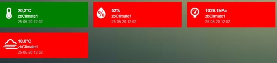
If a device consists of several subdevices, like a TempHumBar device or SmartMeter, then for each subdevice a block will be generated.
In this example device device 659 is a TempHumBar device:
columns[1] = {
  blocks: [659]
}
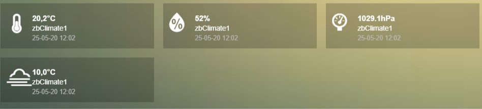
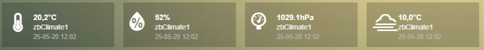
In case I want to show all four subdevices onto one row I’ve to change the default width from 4 to 3:
blocks[659] = {
  width:4
}
columns[1] = {
  blocks: [659]
}
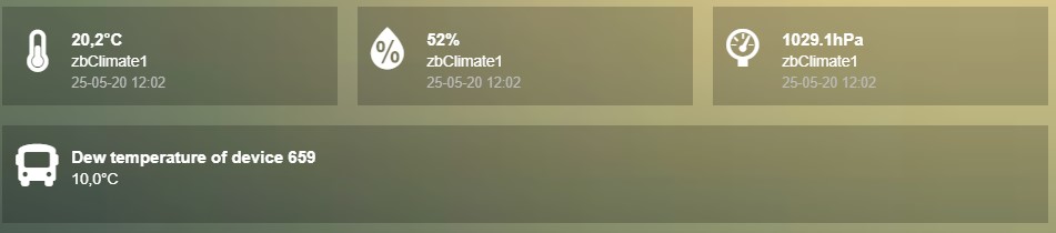
Now assume I want to have the first 3 subdevices on one row, and the fourth device on a new row, full width, with some additional customizations:
blocks[659] = {
  width:4
}

blocks['659_4'] = {
  width:12,
  title: 'Dew temperature of device 659',
  icon: 'fas fa-bus',
  last_update: 'false',
  switch: true
}

columns[1] = {
  blocks: [659]
}

In the previous example first the settings of ``block[659]`` will be applied to all subblocks, followed by a subblock if it has been defined.
(In this case ``blocks['659_4']``)
In case you only want to show subdevice 1, the column definition should be as follows:
columns[1] = {
  blocks: [ '659_1' ]
}
Don’t forget the tick marks around 659_1
As for single device it’s also possible to use a custom block key in combination with the idx parameter.
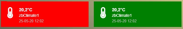
To make this visible I’ve defined two classes in custom.css:
.css_red {
  background-color: red !important;
}

.css_green {
  background-color: green !important;
}
Now I’ll add the temperature twice, with different backgrounds:
blocks['659_1'] = {
  addClass: 'css_red'
}

blocks['another'] = {
  idx: '659_1',
  addClass: 'css_green'
}

columns[1] = {
  blocks: [ '659_1', 'another' ]
}
You can also change a subdevice of a block with custom key:
blocks['another'] = { //This block will show domoticz device 659
  idx: 659,
  addClass: 'css_red'
}

blocks['another_1'] = { //This block will be applied to subdevice 1 of "another"
  addClass: 'css_green'
}

columns[1] = {
  blocks: [ 'another' ]
}
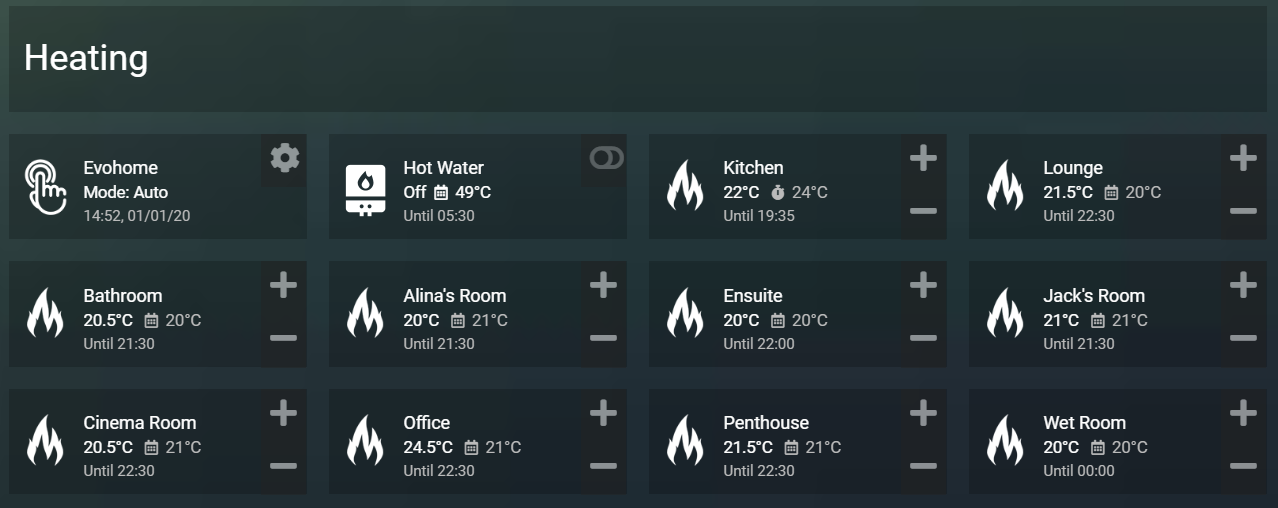
Thermostat devices
For a thermostat IDX, IDX_1 or IDX_2 can be used. If IDX_1 is used the thermostat +/- buttons will not be shown. If IDX_2 is used the icon/image of the block can be changed as in a normal block.
blocks['123_2'] = {
    image: 'toon.png'
}
Usage of popup graph window
With the popup parameter you can configure to open a popup graph window. Example:
blocks[258] = {
   title: 'Consumption',
   flash: 500,
   width: 4,
   popup: 'popup_consumption'
}
In this example, the specified popup will use a defined graph called ‘popup_consumption’ instead of the default popup. This defined graph is then added to the config.js just like a normal graph:
blocks['popup_consumption'] = {
   title: 'Energy Consumption Popup',
   devices: [258],
   toolTipStyle: true,
   datasetColors: ['red', 'yellow'],
   graph: 'line',
   legend: {
      'v_258' : 'Usage',
      'c_258' : 'Total'
   }
}
Usage of popup multi block window
With the popup parameter you can also configure to open a popup multi block window. Example:
blocks['your_block'] = {
   popup: 'container',
   ...
}
blocks['container'] = {
   blocks: [ 'one1', 'two2']   // where 'one1' and 'two2' are other blocks
}
Usage of openpopup(On)(Off)
With the openpopup, openpopupOn and openpopupOff parameter you can configure to open a popup window when the device changes. Example:
blocks[123]['openpopup'] = {
    url: 'http://www.urltocamera.nl/image.jpg',   //Open a popup window with this url when the device changes
    framewidth:500,                               //specific width of the frame
    frameheight:400,                              //specific height of the frame
    auto_close: 5                                 //auto close the popup window after 5 seconds.
}

blocks[123]['openpopupOn'] = {
    url: 'http://www.urltocamera.nl/image.jpg',   //Open a popup window with this url when the device changes to On
    framewidth:500,                               //specific width of the frame
    frameheight:400,                              //specific height of the frame
    auto_close: 5                                 //auto close the popup window after 5 seconds.
}

blocks[123]['openpopupOff'] = {
    url: 'http://www.urltocamera.nl/image.jpg',   //Open a popup window with this url when the device changes to Off
    framewidth:500,                               //specific width of the frame
    frameheight:400,                              //specific height of the frame
    auto_close: 5                                 //auto close the popup window after 5 seconds.
}
To remove the close button of the block-popup add the following text to custom.css:
.frameclose { display: none; }
Flash on change
To control the flashing of the block when it’s value change you can set the flash parameter.
Via the style blockchange in custom.css you can set the class-style that needs to be applied.
Example CONFIG.js:
blocks[123] = {             //123 is the Domoticz device ID
  title: 'My new device',
  flash: 500                //flash effect of 500 ms
}
Example custom.css (only needed in case you want to change the default flash effect):
.blockchange {
  background-color: #0f0 !important;
}
Evohome
The following config parameters from CONFIG.js are applicable:
Parameter |
Description |
|---|---|
evohome_status |
|
evohome_boost_zone |
|
evohome_boost_hw |
|
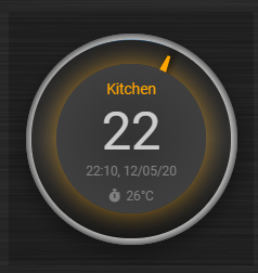
The EvoHome devices can be represented as dial by adding type: 'dial' to the block definition. See Dial
Formatting
You can define the default unit text and number of decimals to show for some (most?) blocks by adding the following to CONFIG.js:
config['units'] = {
  names: {
    kwh: 'kWh',
    watt: 'W',
    gas: 'm3',
    water: 'l',
    time: ''
  },
  decimals: {
    kwh: 1,
    watt: 0,
    gas: 1,
    water: 0,
    time: 0
  }
}
You can also define the unit parameter on block level by setting the unit parameter:
blocks[123] = {
  unit: 'Watt'
}
RGB Color picker
By setting the block parameter colorpicker to a non-zero value a color picker dropdown button will be added to a RGB device.
With colorpicker:1 the old style colorpicker will be added:
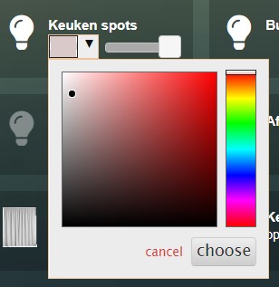
With colorpicker:2 the enhanced colorpicker will be selected.
The colorpicker configuration depends on the RGB type.
The behavior is the same as in Domoticz.
The following Domoticz RGB devices are supported:
RGB: Plain RGB dimmer
RGBW: RGB dimmer with white modus
RGBWW: RGB dimmer with white modus and adjustable white color temperature
RGBWZ: Dimmer with seperate adjustable levels for RGB and White leds
RGBWWZ: Adjustable levels for RGB and White, adjustable white color temperature
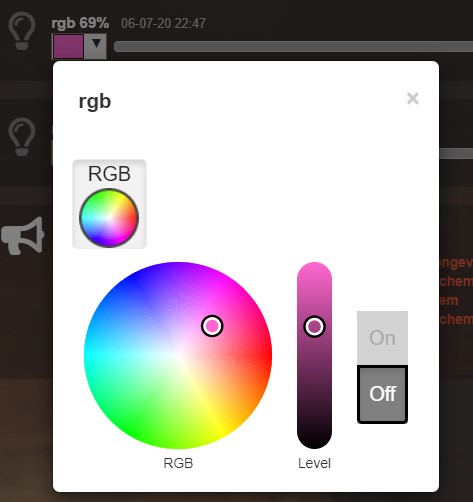
RGB device
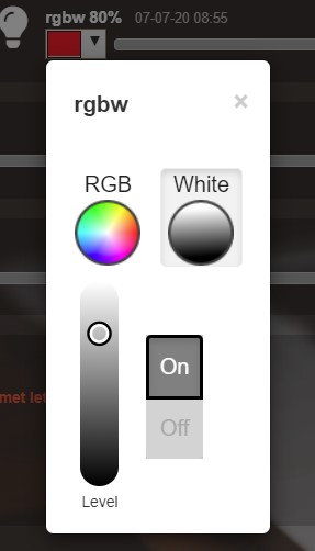
RGBW device in white modus.
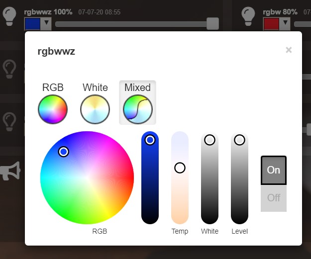
RGBWWZ device in Mixed modus.
In this last example you see from left to right the RGB color picker, the RGB color level, the white color temperature, the white level and the master level.
For Hue RGBWW device add the following block parameter for correct functioning:
mode: 1
On some displays the colorpicker popup window may look too small.
You can adjust the size of the colorpicker popup window, for colorpicker:2 only, by defining the colorpickerscale block parameter:
//example of a block that scales the colorpicker popup size to 150%
blocks['rgb'] = {
  colorpicker: 2,
  colorpickerscale: 1.5,
  idx: 14
}
Normally the dimmer will switch on/off by clicking on the block.
If you add switchMode: 'color' to the block definition the colorpicker popup window will open on click:
blocks['rgb'] = {
  colorpicker: 2,
  switchMode: 'color',
  idx: 14
}
Battery level
A battery level indicator will be displayed when the battery level is below a certain threshold.
For battery powerered devices the minimum level is 0, and the maximum level 100. For devices without a battery the battery level will always be 255.
To display the battery indicator for all battery powered devices set the batteryThreshold to 100:
config['batteryThreshold'] = 100;
or configure it for a specific block:
blocks[123] =  {
  batteryThreshold: 100
}
The following indicators will be displayed:
Min battery level |
Max battery level |
icon |
|---|---|---|
0 |
10% |
fa-battery-empty |
10% |
35% |
fa-battery-quarter |
35% |
60% |
fa-battery-half |
60% |
90% |
fa-battery-three-quarters |
90% |
100% |
fa-battery-full |
The battery symbols can be styled in custom.css. As an example the default styling for battery empty:
.battery-level.fa-battery-empty {
  color:red;
  z-index: 15;
}
To hide the number, add the following to custom.css:
.battery-percentage {
  display:none
}
Multiple Values Block
Assuming your device is a P1 smart meter, you can use the following block definition:
blocks['customblock'] = {
  idx: '43_1',
  title:"Actual: <Usage>",
  value: "Today: <NettCounterToday> kWh",
  format:true,
  decimals: 1
}
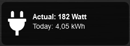
Instead of 43 use the Domoticz device ID of your own device.
For as well the title field as the value field of a Domoticz block you can indicate to fill in the value of a Domoticz device parameter by using the ‘<’ and ‘>’ symbol.
For a smart meter device you can use the following device parameters:
Usage(=Actual power entering your house)UsageDeliv(=Actual power leaving your house)NettUsage(=Usage - UsageDeliv)CounterToday(=Energy entered your house today)CounterDelivToday(=Energy left your house today)NettCounterToday(=CounterToday - CounterDelivToday)Counter(=Total counter of energy that entered your house)CounterDeliv(=Total counter of energy that left your house)NettCounter(=Counter - CounterDeliv)
All parameter names are case sensitive.
For more fancy computations you can create your custom getStatus function in custom.js
Block background image

Via the backgroundimage parameter the url of a background image can be defined.
Instead of an url you can also fill in a Domoticz text device id.
This Domoticz text device should then contain the url pointing to the image to be used as background for the block.
The size can be adjusted via the backgroundsize parameter, and the opacity can be set via the backgroundopacity parameter.
Example:
blocks['curtains'] = {
    idx: 179,
//    backgroundimage: './img/curtains.png'
    backgroundimage: 182,
    backgroundsize: '50%',
    backgroundopacity: 0.3,
}
In the example above Domoticz device 182 is used to obtain the url of the background image.
Example how to set the content of a Domoticz text device:
http://domoticz:8080/json.htm?type=command¶m=udevice&idx=182&nvalue=0&svalue=https://www.schoolplaten.com/afbeelding-huis-dl28257.jpg
Styling
The following CSS classes will be attached to a Domoticz block automatically:
on. In case a Domoticz switch is in the On (or closed) stateoff. In case a Domoticz switch is not in the On (or closed) state.timeout. In case the Domoticz device is in timeout state.
To give Domoticz blocks with a device in timeout state a red background, add the following to custom.css:
.mh.timeout {
    background-color:rgba(255,0,0,0.3);
}