Graphs
If your Domoticz device contains a value (temperature, humidity, power, etc.) then when you click on the block a popup window will appear showing a graph of the values of the device. These popups can be customized by using the ‘popup’ parameter.
Besides popup graphs it’s also possible to show the graph directly on the dashboard itself.
If you want to show the (undefined) graph of the data of a single device, you can add the graph-id to a column definition as follows:
//Adding a graph of device 691 to column 2
columns[2]['blocks'] = [
  ...,
  'graph_691',      //691 is the device id for which you want to show the graph
  ...
]
For a defined graph you have to add a block definition to CONFIG.js and add the devices-parameter:
blocks['my_graph'] = {     //my_graph can be any name you want, as long as you add 'devices' to the block
    ...,
    devices: [691],     //691 is the device id
    ...
}

columns[2]['blocks'] = [
    ...,'my_graph',...
]
It’s also possible to combine the data from several devices into one graph. In that case you have to add a block definition to CONFIG.js and add the devices-parameter:
blocks['my_multi_graph'] = { //my_multi_graph can be any name you want, as long as you add 'devices' to the block
    devices: [691, 692] //691 and 692 are the device id's you want to have combined into one graph
}

columns[2]['blocks'] = [
  ...,
  'my_multi_graph',
  ...
]
The following block parameters can be used to configure the graph:
Parameter |
Description |
|---|---|
devices |
an array of the device ids that you want to report on, e.g. for single graph [22] or multigraph [ 17, 18, 189 ] |
graph |
Sets the graph type
'line' Line graph (default)'bar' Bar graph |
graphTypes |
Array of values you want to show in the graph. Can be used for Domoticz devices having several values.
['te']: Temperature['hu']: Humidity['ba']: Barometer['gu', 'sp']: wind guts and speed['uvi'], ['lux'], ['lux_avg'], ['mm'], ['v_max']['v2'], ['mm'], ['eu'], ['u'], ['u_max'], ['co2'] |
GroupBy |
This allows users to group their data by hour, day, week or month, where applicable ranges are used. See GroupBy.
The GroupBy function will either:
- The Sum of all values together for that group
- Provide the Average of all values for that group
It identifies what type of sensor it is to apply to appropriate calculation:
- Counter, Rain – uses the Add calculation
- Temperature, Custom Sensor and Percentage – uses the Average calculation
|
aggregate |
In a graph block you can add the parameter ‘aggregate’ which can have the value sum or avg to define how to compute the aggregation.
sum: show the sum.avg: shows the average. |
groupByDevice |
allowing user to show the status of several devices in a single graph. Instead of the data being group by time intervals, it is grouped by the devices. See groupByDevice.
false: disables the feature (default)true: enables the feature and display a vertical bar chart, grouped by device'vertical': is the same as true'horizontal': enables the feature and display a horizontal bar chart, grouped by device- Setpoint devices will be displayed as a line infront of the bar graph
- For Evohome devices: The tooltip info will display the status and schedule
|
labels |
An array to rename the device names (groupByDevice charts only)
['Device A', 'Device B'] The first device will be labeled as Device A, the second as Device B |
stacked |
|
beginAtZero |
This forces the Y axis to begin at 0 (zero). The beginAtZero setting can accomodate multiple Y axes. For example, for a graph with 3 Y axes, you can use: |
height |
|
width |
|
displayFormats |
Object to set the time display format on the x-axis. See Time format on the x-axis. |
ylabels |
To define the y-axes for a custom graph. See Y-axis for custom graphs. |
custom |
Customized graph. See Custom graphs. |
interval |
a time based limiter, to limit time data, e.g. 2 will show 1/2 the time labels, 5 will show 20% of the time labels (default is 1) |
maxTicksLimit |
specifies how many labels (ticks) to display on the X axis, this does not limit the data in the graph, e.g. 10 (default is all) |
cartesian |
scales the graph with standard ‘linear’ scale, or ‘logarithmic’, an algorithm to ensure all data can be seen (default is linear) |
datasetColors |
|
iconColour |
colours the graph’s title icons (default is grey) |
fontColor |
font color for the axis ticks and labels (default is white) |
lineFill |
if line graph, this fills the graph, it is an array for each dataset, e.g.[‘true’, ‘false’, ‘true’] (default is false) |
axisRight |
if |
axisAlternate |
if |
borderWidth |
this is actually the width of the line (default is 2) |
borderDash |
use if you want a dashed line, it takes an array of two values; length of the line and the space, e.g. [ 10, 10 ] (default is off) |
borderColors |
handy for bar graphs, takes an array of colours like datasetColors, e.g. [‘red’, ‘green’, ‘blue’] (default uses datasetColors) |
pointRadius |
the size of each data point, e.g. 3 (default is 1) |
pointStyle |
an array of the shape of each point, such as circle|cross|dash|line|rect|star|triangle, e.g.[‘star’,’triangle’] (default is circle) |
pointFillColor |
an array containing the colour of each point, e.g. [‘red’, ‘green’, ‘blue’] (default uses datasetColors) |
pointBorderColor |
an array containing the border colour of each point, e.g. [‘red’, ‘green’, ‘blue’] (default is light grey) |
pointBorderWidth |
the thickness of the point border, e.g. 2 (default is 0) |
barWidth |
if a bar graph, this is the width of each bar, 0-1, e.g. 0.5 is half bar, half gap (default is 0.9) |
reverseTime |
use this if you want to reverse your X axis, i.e. setting ‘true’ would mean the time will be reversed (default is false) |
lineTension |
sets the bezier curve the line is, 0 is straight, 1 is extremely curved! e.g. 0.4 gives a nice bendy line (default is 0.1) |
drawOrderLast |
an array stating the order in which each dataset should be added to the graph for “last hours”, e.g. [‘v_idx2’, ‘v_idx1’] |
drawOrderDay |
an array stating the order in which each dataset should be added to the graph for “today”, e.g. [‘v_idx3’, ‘v_idx1’, ‘v_idx2’] |
drawOrderMonth |
an array stating the order in which each dataset should be added to the graph for “last month”, e.g. [‘v_idx1’, ‘v_idx2’, ‘c_idx1’, ‘c_idx2’] |
buttonsBorder |
color of the buttons border, e.g. ‘red’, default is ‘white’ |
buttonsColor |
color of the buttons text, e.g. ‘#fff’ or ‘white’, default is ‘black’ |
buttonsFill |
color of the buttons background colour, e.g ‘#000’ or ‘black’, default is ‘white’ |
buttonsIcon |
color of the buttons icon, e.g. ‘blue’, default is ‘grey’ |
buttonsMarginX |
gap (or margin) between the buttons (left and right), e.g. 5, default is 2 |
buttonsMarginY |
gap (or margin) above and below the buttons, e.g. 5, default is 0 |
buttonsPadX |
padding inside the buttons (left and right), e.g. 10, default is 6 |
buttonsPadY |
padding inside the buttons, top and bottom, e.g. 5, default is 2 |
buttonsRadius |
the curveture of the corners of the buttons, e.g. 10, default is 4 |
buttonsShadow |
the shadow below the button in RGBA format (last number is opacity), e.g. ‘rgba(0,0,0,0.5)’, default is off |
buttonsSize |
the size of the button, e.g. 12, default is 14 |
buttonsText |
change the text displayed on each button in an array, e.g. [‘Now’, ‘Today’, ‘Month’], default is what you see today |
gradients |
an array of arrays, e.g. gradients: [ [‘white, ‘blue’], [‘orange’, ‘powderblue’] ], default disabled |
gradientHeight |
a number showing the height of the gradient split, e.g. 0.8, default 1 |
spanGaps |
If true, lines will be drawn between points with no or null data. If false, points with NaN data will create a break in the line. |
sortDevices |
the code automatically calculate if any devices’ time data is longer than others. It then use that device’s time data, then match all of the devices non-time data to that. This setting allows users to choose to enable or disable that feature (true or false) |
steppedLine |
defines the interpolation method. It can be a single value
'before', or an array of values ['before', false, false]
| false (default) No stepped line but interpolation
| true The line steps just before the new value
| 'before' The line steps just before the new value (same as true)
| 'after' The line steps just after the new value
| 'middle' The line steps between the old and the new value |
customHeader |
|
format |
false (default). Show the value in the graph header as reported by Dashticz.
| true. Format the graph header value using the decimals parameter and the config settings _THOUSAND_SEPARATOR and _DECIMAL_POINT. See Number format |
decimals |
|
popup |
|
tooltiptotal |
Display graph tooltiptotal instead of the standard one. |
zoom |
Allows graph zoom controls and orientation. See Zoom.
'x': allow zooming on the x axis (left to right)'y': allow zooming on the y axis (top to bottom)'xy': allow zooming in any direction'false': disable zooming, do not show zoom button |
debugButton: true |
Users can now debug their graph by setting their graph’s block config, e.g. |
We will show the possibilities by showing a:
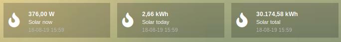
Simple energy device (Solar panel)
Climate device (temperature, humidity, barometer)
P1 Smart Meter
Simple energy device
The solar panel device has device id 6. First we add it to a column without any additional configuration parameters, to show the default result:
columns[2]['blocks'] = [
  6
]
As you see three buttons are generated (actual power, energy today, total energy). I only want to have one button, so I change my column definition to:
columns[2]['blocks'] = [
  '6_1'
]
By pressing the button the following graphs pops up:
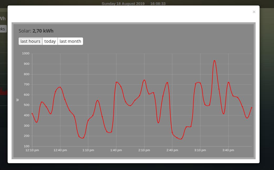
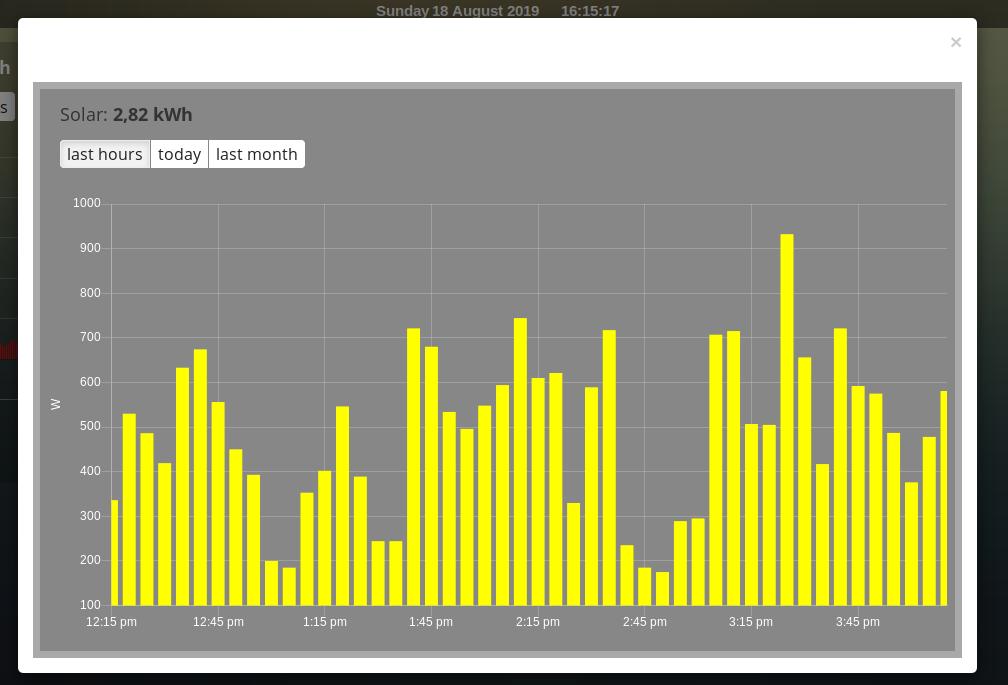
So, nothing special. Only the red line color is maybe a bit too much. Let’s change it into a yellow bar graph. We have to add a block definition:
blocks['graph_6'] = {
    devices: [6],
    graph: 'bar',
    datasetColors: ['yellow']
}
Now I want to add a legend at the bottom:
blocks['graph_6'] = {
    devices: [6],
    graph: 'bar',
    datasetColors: ['yellow'],
    legend: true
}
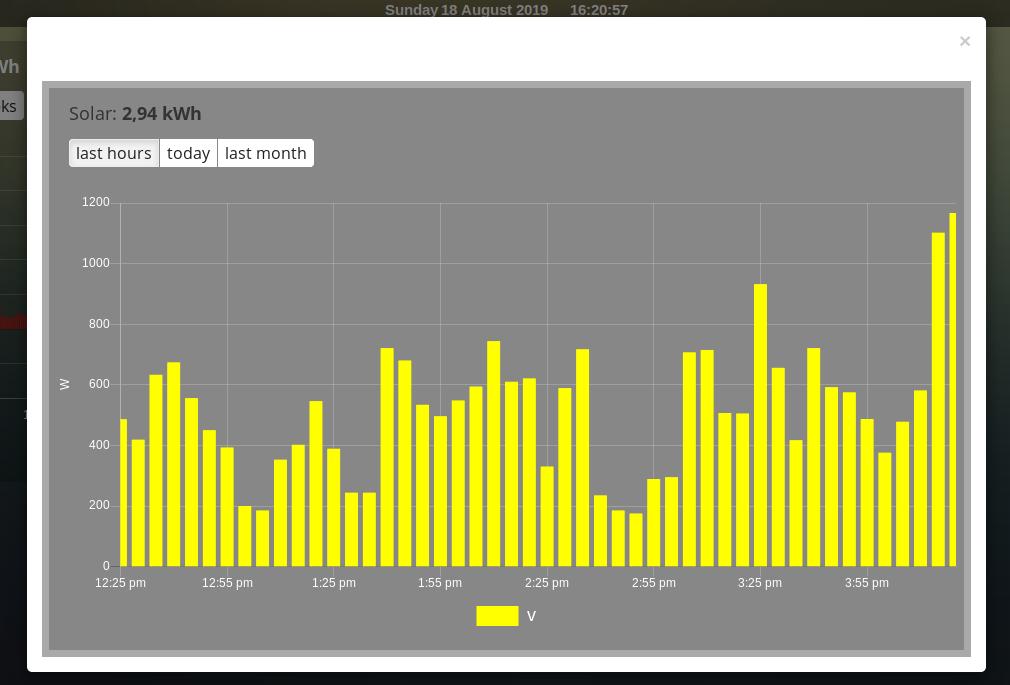
As you can see the data points are labeled as ‘V’. This name is generated by Domoticz. We can translate the Domoticz name in something else, by extending the legend parameter
blocks['graph_6'] = {
    devices: [6],
    graph: 'bar',
    datasetColors: ['yellow'],
    legend: {
      'v': 'Power generation'
    }
}
legend is an object consisting of key-value pairs for the translation from Domoticz names to custom names.
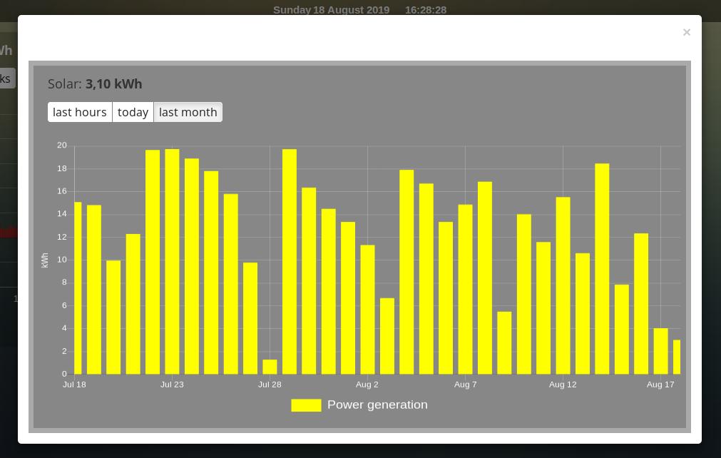
After pressing the ‘Month’ button on the popup graph:
Climate device
First let’s add a climate device with Domoticz ID 659 to a column:
columns[3]['blocks'] = [
    'graph_659'
]
This will show the graph directly on the Dashticz dashboard:
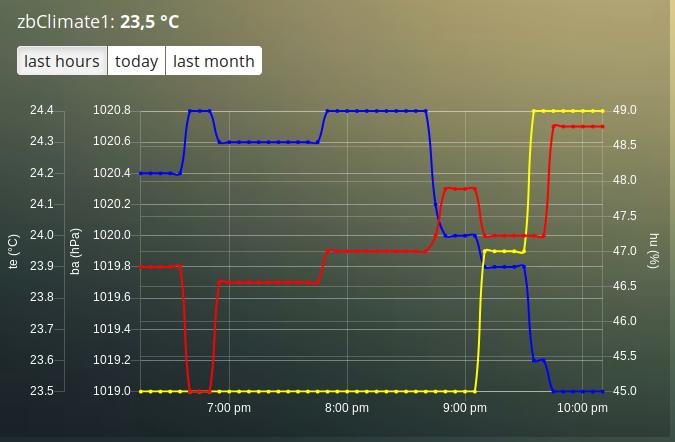
As you can see the climate device has three subdevices (temperature, humidity, pressure). Since these are different properties three Y axes are being created.
If you prefer to only see the temperature and humidity add a block definition:
blocks['graph_659'] = {
    devices: [659],
    graphTypes : ['te', 'hu'],
    legend: true
}
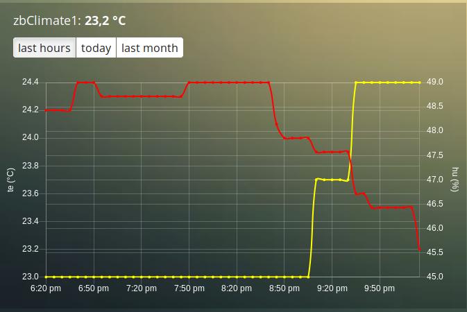
Of course you can add a legend as well. See the previous section for an example.
P1 smart meter
First let’s show the default P1 smart meter graph:
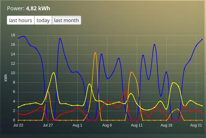
You see a lot of lines. What do they mean? Let’s add a legend
blocks['graph_43'] = {
    devices: [43],
    legend: true
}
This gives:
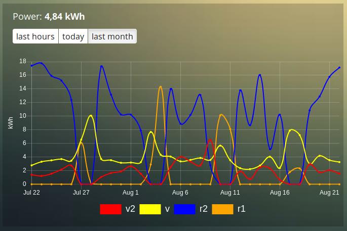
That doesn’t tell too much. However, this are the value names as provided by Domoticz. Now you have to know that a P1 power meter has 4 values:
Power usage tariff 1
Power usage tariff 2
Power delivery tariff 1
Power delivery tariff 2
The first two represent the energy that flows into your house. The last two represent the energy that your house delivers back to the grid.
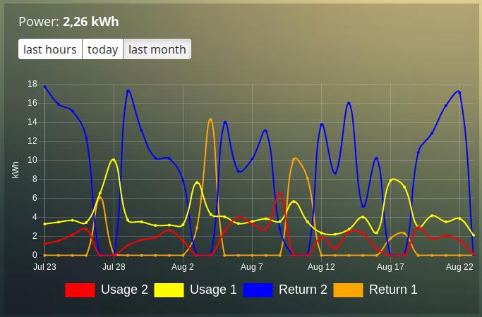
So we can add a more meaningful legend as follows:
blocks['graph_43'] = {
    devices: [43],
    legend: {
      v_43: "Usage 1",
      v2_43: "Usage 2",
      r1_43: "Return 1",
      r2_43: "Return 2"
}
Resulting in:
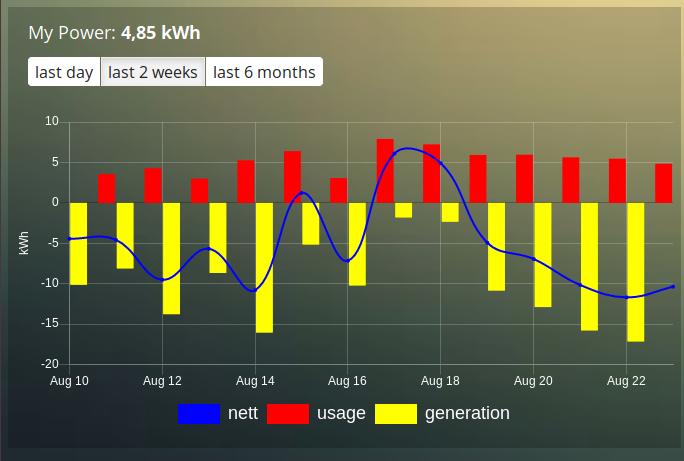
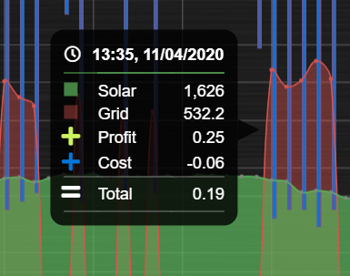
However what I would like to see is:
The sum of Usage 1 and Usage 2
The sum of Return 1 and Return 2, but then negative
A line to show the nett energy usage: Usage 1 + Usage 2 - Return 1 - Return 2
The usage and return data should be presented as bars. The nett energy as a line.
Can we do that? Yes, with custom graphs!
Custom graphs
I use the P1 smart meter as an example again to demonstrate how to create custom graphs. First the code and result. The explanation will follow after that:
blocks['graph_43'] = {
    title: 'My Power',
    devices: [43],
    graph: ['line','bar','bar'],
    custom : {
        "last day": {
            range: 'day',
            filter: '24 hours',
            data: {
                nett: 'd.v_43+d.v2_43-d.r1_43-d.r2_43',
                usage: 'd.v_43+d.v2_43',
                generation: '-d.r1_43-d.r2_43'
            }
        },
        "last 2 weeks": {
            range: 'month',
            filter: '14 days',
            data: {
                nett: 'd.v_43+d.v2_43-d.r1_43-d.r2_43',
                usage: 'd.v_43+d.v2_43',
                generation: '-d.r1_43-d.r2_43'
            }
        },
        "last 6 months": {
            range: 'year',
            filter: '6 months',
            data: {
                nett: 'd.v_43+d.v2_43-d.r1_43-d.r2_43',
                usage: 'd.v_43+d.v2_43',
                generation: '-d.r1_43-d.r2_43'
            }
        }
    },
    legend: true,
    datasetColors:['blue','red','yellow']
}
This will give:
As you can see, the graph has
title, set via the
titleparameterdevices, set via the
devicesparametercustom colors, defined by the parameter
datasetColorsThe
graphparameter is used to define the graph types. This time it’s an array, because we want to select the graph type per value.legendset to true, to show a default legendcustom buttons, defined by the
customparameter
A custom object start with the name of the button. The button should contain the following three parameters:
range. This is the name of the range as requested from Domoticz, and can be'day','today','month'or'year'. The range'today'filters the data to today, independent of the setting in Domoticz, and sets the graph x-axis to the full day.filter(optional). This limits the amount of data to the period as defined by this parameter. Examples:'2 hours','4 days','3 months'
Special filters exist. Value 'todaytomorrow' will filter the graph data of today and tomorrow. This can be used for instance for showing one day ahead dynamic energy prices.
data. This is an object that defines the values to use for the graph.buttonIcon(optional). The Fontawesome icon to use for the button. Example'fas fa-bus'
As you can see in the example the first value will have the name ‘nett’. The formula to compute the value is:
'd.v_idx+d.v2_idx-d.r1_idx-d.r2_idx'
The d object contains the data as delivered by Domoticz. As you maybe remember from a previous example
Domoticz provides the two power usage values (v_idx and v2_idx) and the two power return values (r1_idx and r2_idx).
So the first part sums the two power usage values (d.v_idx+d.v2_idx) and the last parts substracts the two return values (-d.r1_idx-d.r2_idx),
The two other value-names in the data object (usage and generation) will compute the sum of the power usage values and the power return values respectively.
Maybe a bit complex in the beginning, but the Dashticz forum is not far away.
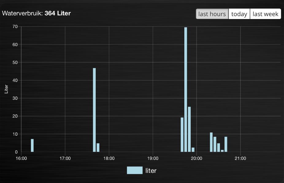
Below another example to adapt the reported values of a watermeter to liters:
blocks['graph_903'] = {
    graph: 'bar',
    devices: [903],
    datasetColors: ['lightblue'],
    legend: true,
    custom : {
        "last hours": {
            range: 'day',
            filter: '6 hours',
            data: {
                liter: 'd.v_903*100'            }
            },

  "today": {
            range: 'day',
            filter: '12 hours',
            data: {
                liter: 'd.v_903*100'            }
            },

  "last week": {
            range: 'month',
            filter: '7 days',
            data: {
                liter: 'd.v_903*1000'            }
            }


        }
  }
Time format on the x-axis
The chart module uses moments.js for displaying the times and dates. The locale will be set via the Domoticz setting for the calendar language:
config['calendarlanguage'] = 'nl_NL';
To set the time (or date) format for the x-axis add the displayFormats parameter to the block definition:
blocks['graph_6'] = {
    devices: [6],
    displayFormats : {
      minute: 'h:mm a',
      hour: 'hA',
      day: 'MMM D',
      week: 'll',
      month: 'MMM D',
    },
}
The previous example sets the time formats to UK style. See https://www.chartjs.org/docs/latest/axes/cartesian/time.html#display-formats for time/date formats.
Modifying the y-axes
You can modify the y-axes by setting the options parameter. Below you see an example how to define the min and max values of two y-axes:
blocks['graph_659'] = {
    devices: [659],
    graph: 'line',
    graphTypes: ['te', 'hu'],
    options: {
        scales: {
            yAxes: [{
                ticks: {
                    min: 0,
                    max: 30
                }
            }, {
                ticks: {
                    min: 50,
                    max: 100
                }
            }]
        }
    }
}
The yAxes parameter in the options block is an array, with an entry for each y-axis.
Example to set the step-size of the y-axis:
blocks['graphstep'] = {
        devices: [1396],
        type: 'graph',
        graphTypes: ['v'],
        ylabels: ['Watt'],
        options: {
                scales: {
                        yAxes: [{
                                ticks: {
                                        stepSize: 1000
                                }
                        }],
                }
        }
}
Y-axis for custom graphs
To define the y-axes for a custom graph you can add the ylabels parameter as follows:
blocks['graph_659'] = {
    devices: [659],
    custom: {
        'The Temp': {
            ylabels: ['yaxis of temp'],
            data: {
                'temp value': 'd.te_659'
            },
            range: 'day',
            filter: '2 days',
            legend: true
        }
    },
    width: 6
}
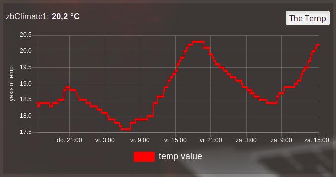
The parameter ylabels is an array. You can add a string for each value of the data object.
Custom colors
Custom colors can be defined by the parameter datasetColors:
datasetColors: ['red', 'yellow', 'blue', 'orange', 'green', 'purple']
Optional: If you want to use custom color names you have to set the variable dataset colors to html colors, hex code, rgb or rgba string:
datasetColors: [colourBlueLight, colourLightGrey, colourBlue]
var colourBlueLight= 'rgba(44, 130, 201, 1)';       // rgba
var colourLightGrey= '#D3D3D3';                     // hex code
var colourBlue= 'Blue';                             // html color
Custom button styling
blocks['multigraph_1'] = {
        ...
        buttonsPadX: 10,
        buttonsPadY: 10,
        buttonsBorder: 'red',
        buttonsColor: '#fff',
        buttonsFill: '#000',
        buttonsIcon: 'red',
        buttonsMarginX: 5,
        buttonsMarginY: 5,
        buttonsRadius: 20,
        buttonsShadow: 'rgba(255, 255, 255, 0.1)',
        buttonsSize: 12,
        ...
}
Custom point styling
var hot = new Image();
hot.src = "img/hot.png"
var cold = new Image();
cold.src = "img/cold.png"

blocks['multigraph_2'] = {
...
pointStyle: [cold, hot ],
...
}
customHeader
The parameter customheader can be a:
string
function
object
Examples for each type are presented below.
Example of graph showing long data values in header:
We can now update the block with the customHeader object as shown below:
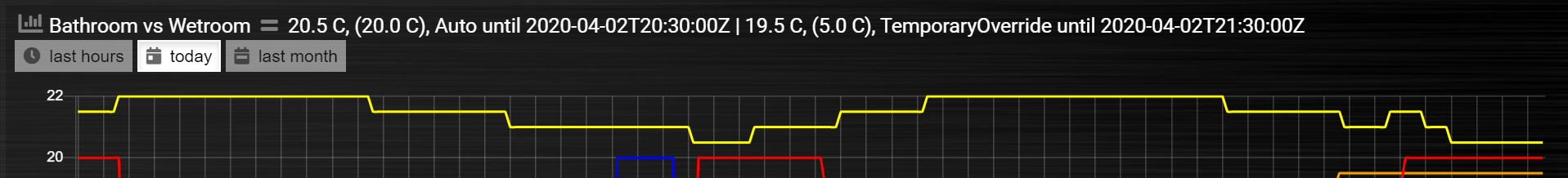
blocks['bathroom_wetroom'] = {
        title: 'Bathroom vs Wetroom',
        devices: [12, 13],
        customHeader: {
                12: 'data.split(",").slice(0,2)',                     <---- update/format the data for idx 12
                13: 'data.split(",").slice(0,2)',                     <---- update/format the data for idx 13
                x:  '(data.12-data.13).toFixed(2) + " C"',            <---- append custom data based on idx 12 and idx 13
        },
        tooltiptotal: true,
        graph: "line",
        legend: true
}
The object accepts key value pairs. Standard Javascript or Jquery code can be used, where ‘data’ is the data you want to change.
To format/update the data being displayed by a device, use the idx (number) as the key.
To add a new ‘custom value’ that is a calculation of existing device data, use any letter as the key.
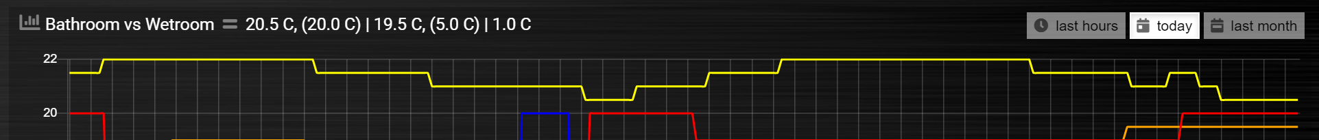
Using the updated block (above), the graph now displays like this (below). The unwanted data has been removed, and a new value (the delta between the 2 devices), “1.0 C”, has been added:
In case customHeader is a string, string will be evaluated, and the result added to the graph title:
customHeader: '"Usage: " + devices[6].Usage + "Delivery: " + devices[6].CurrentDeliv'
The Domoticz devices can be accessed via devices[idx], as you can see in the previous example.
In case the formatting and/or computation is more complex, you can define customHeader as function:
customHeader : function(graph) {
        var devices = Domoticz.getAllDevices();
        var solarGeneration = devices[6].Usage;
        var inflow = devices[43].Usage;
        var outflow = devices[43].UsageDeliv;
        var nett = inflow + solarGeneration - outflow;
        return "Nett: " + nett + " Watt";
},
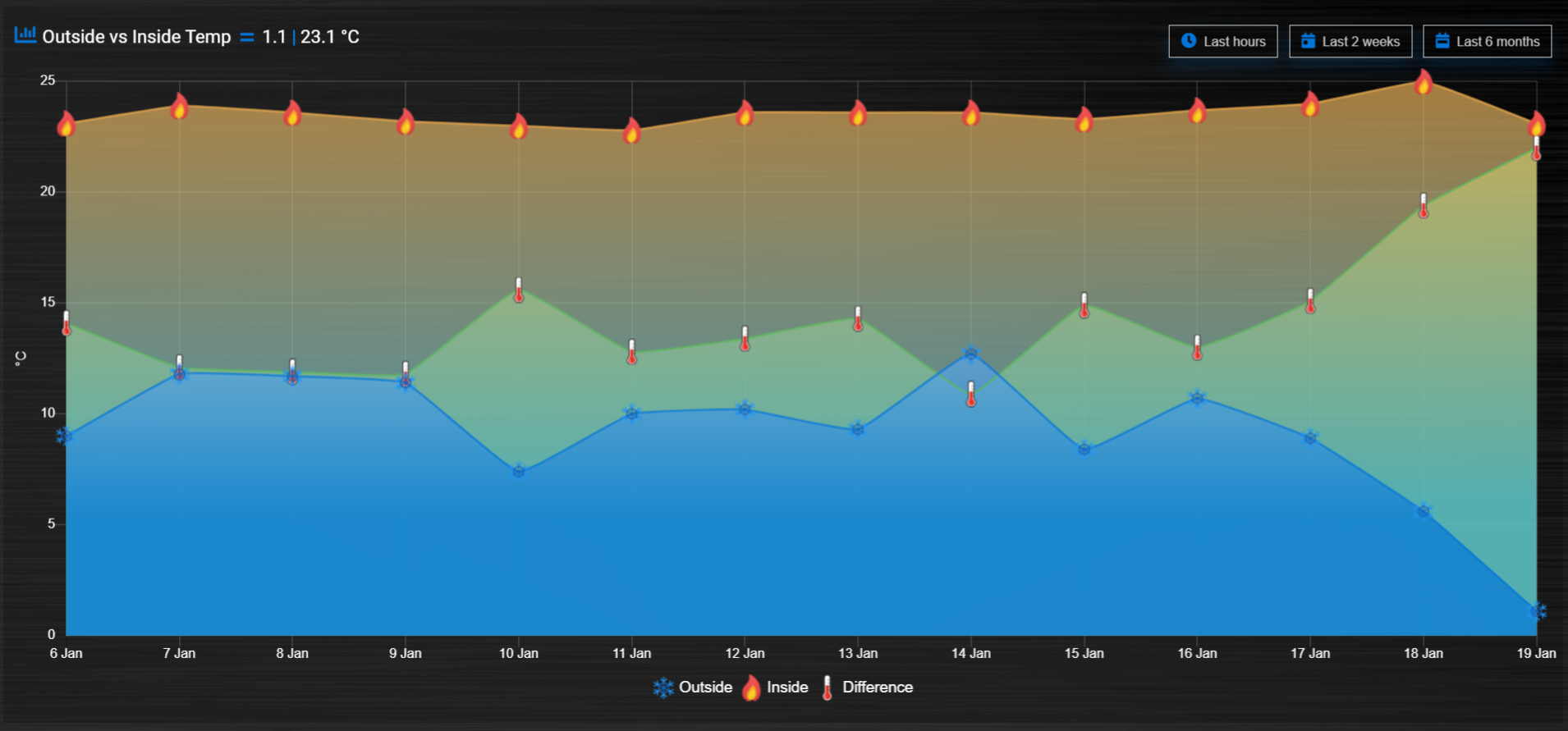
Custom data
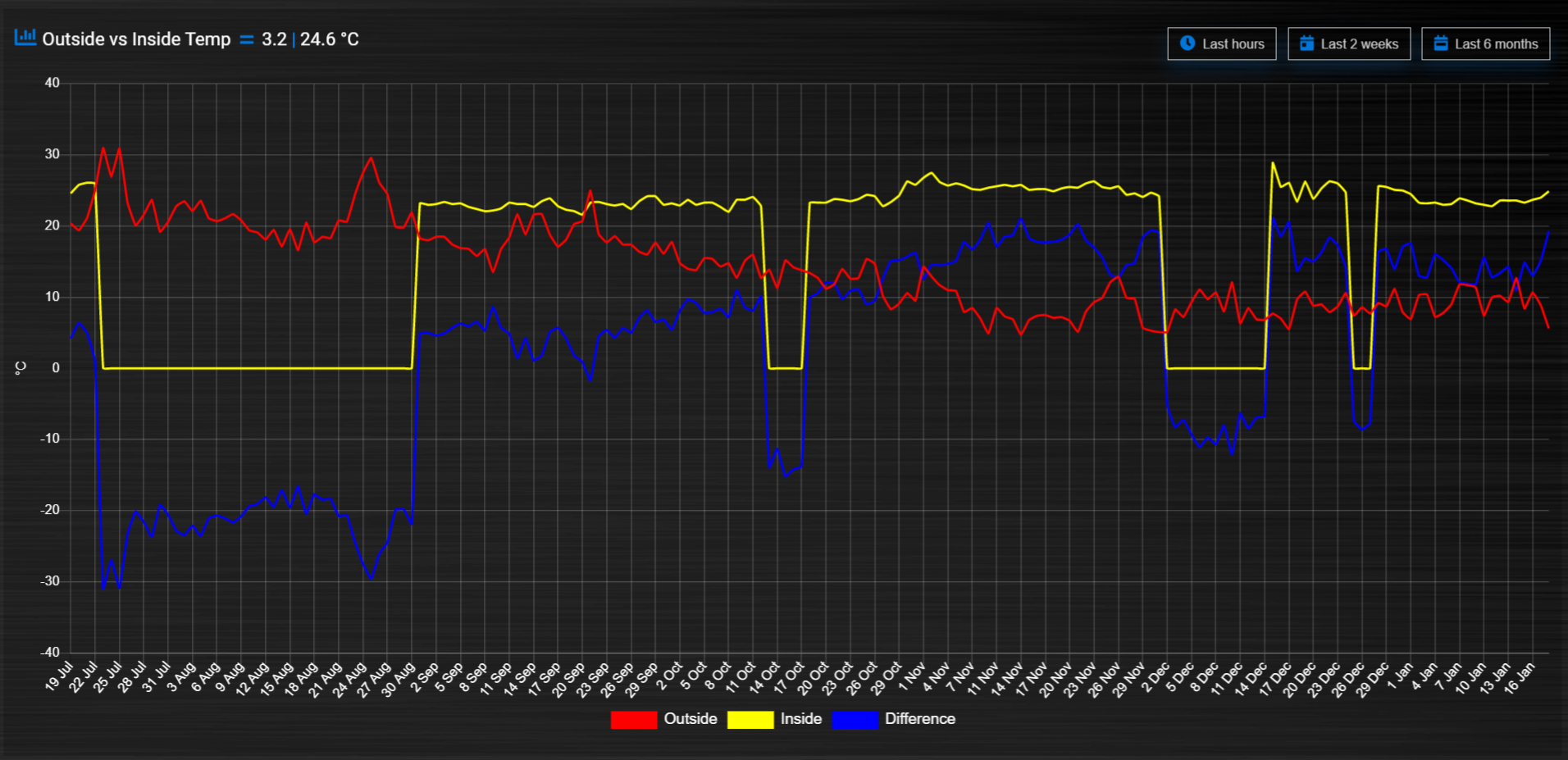
blocks['multigraph_72'] = {
        title: 'Outside vs Inside Temp',
        devices: [ 72, 152],
        graph: 'line',
        buttonsBorder: '#ccc',
        buttonsColor: '#ccc',
        buttonsFill: 'transparent',
        buttonsIcon: 'Blue',
        buttonsPadX: 10,
        buttonsPadY: 5,
        buttonsMarginX: 5,
        buttonsMarginY: 2,
        buttonsRadius: 0,
        buttonsShadow: 'rgba(2, 117, 216, 0.2)',
        buttonsSize: 12,
                custom : {
                        "Last hours": {
                                range: 'day',
                                filter: '6 hours',
                                data: {
                                        te_72: 'd.te_72',
                                        te_152: 'd.te_152',
                                        delta: 'd.te_152-d.te_72'
                                },
                        },
                        "Last 2 weeks": {
                                range: 'month',
                                filter: '14 days',
                                data: {
                                        te_72: 'd.te_72',
                                        te_152: 'd.te_152',
                                        delta: 'd.te_152-d.te_72'
                                }
                        },
                        "Last 6 months": {
                                range: 'year',
                                filter: '6 months',
                                data: {
                                        te_72: 'd.te_72',
                                        te_152: 'd.te_152',
                                        delta: 'd.te_152-d.te_72'
                                }
                        }
                },
        legend: {
                'te_72': 'Outside',
                'te_152': 'Inside',
                'delta': 'Difference'
        }
}
Zoom
The zoom parameter can be set on the graph block as follows:
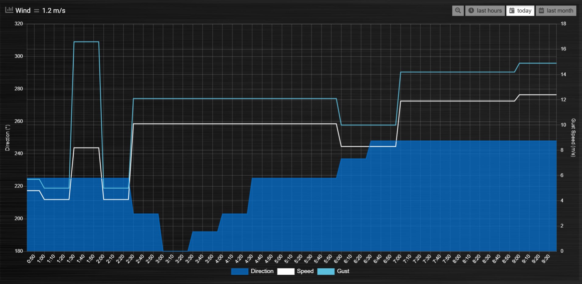
blocks['wind'] = {
        title: 'Wind',
        devices: [73],
        graph: 'line',
        zoom: 'xy',
        legend: {
                'di_73' : 'Direction',
                'sp_73' : 'Speed',
                'gu_73' : 'Gust'
        }
}
The “Wind” graph before zoom “x”:
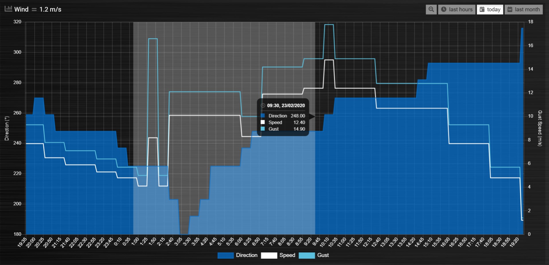
The “Wind” graph after zoom “x”:
GroupBy
The GroupBy parameter can be set on the graph block as follows:
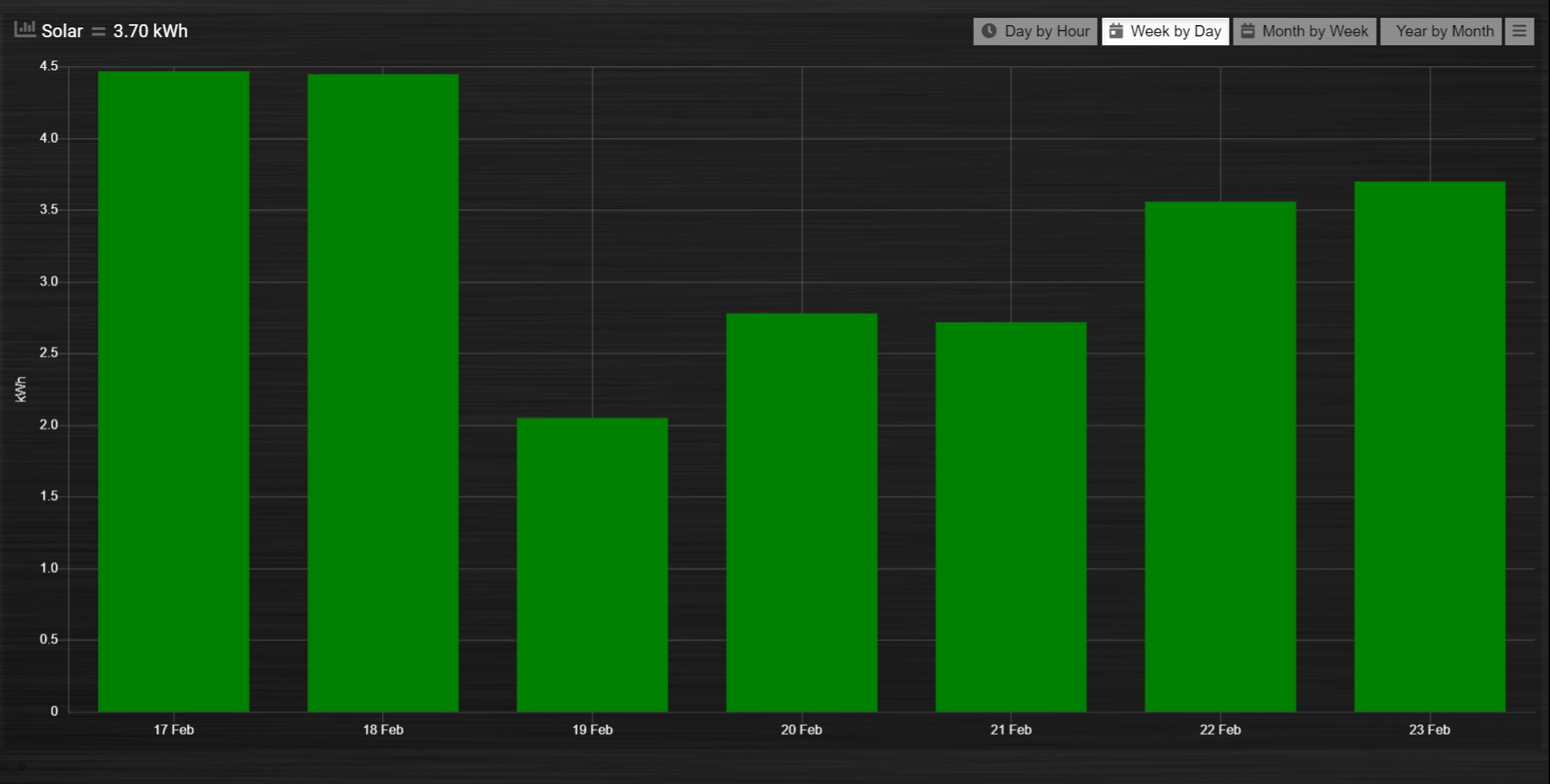
blocks['group_by_solar'] = {
        title: ‘Solar',
        devices: [1],
        graph: ['bar'],
        graphTypes: ['v'],
        groupBy: ‘week’,
        legend: true
}
Alternatively, the param can be applied to custom data as follows:
blocks['group_by_solar'] = {
        title: 'Grouped: Solar',
        devices: [1],
        graph: ['bar'],
        graphTypes: ['v'],
        custom : {
                "Day by Hour": {
                        range: 'last',
                        groupBy: 'hour',
                        filter: '24 hours',
                        data: {
                                Solar: 'd.v_1'
                        },
                },
                "Week by Day": {
                        range: 'month',
                        groupBy: 'day',
                        filter: '7 days',
                        data: {
                                Solar: 'd.v_1',
                        }
                },
                "Month by Week": {
                        range: 'month',
                        groupBy: 'week',
                        data: {
                                Solar: 'd.v_1',
                        }
                },
                "Year by Month": {
                        range: 'year',
                        groupBy: 'month',
                        data: {
                                Solar: 'd.v_1',
                        }
                }
        },
        datasetColors: ['green'],
        legend: true
}
This results in the “Solar” graph grouping its data by hour, day, week or month - Week by Day is shown in the image below:
You can use the block parameter ‘aggregate’ to set the aggregation method as ‘sum’ or ‘avg’ (for average).
Instead of a single string the parameter ‘aggregate’ can also be an array of strings, like
aggregate: ['sum','avg'],
This can be useful in case of a custom graph, showing gas usage and temperature in one graph, because in that situation two different aggregation methods are required.
groupByDevice
The block parameter groupByDevice is showing the live status of several devices in a single graph. Instead of the data being grouped by time intervals, it is grouped by the devices. Note, unlike other graphs, this type of graph does not report on historic data. I.e. there are no ‘last’, ‘today’, ‘month’ buttons.
blocks['server_status'] = {
        title: 'Server Status',
        devices: [17, 18, 189, 190, 192],
        groupByDevice: true,
        beginAtZero: true
}
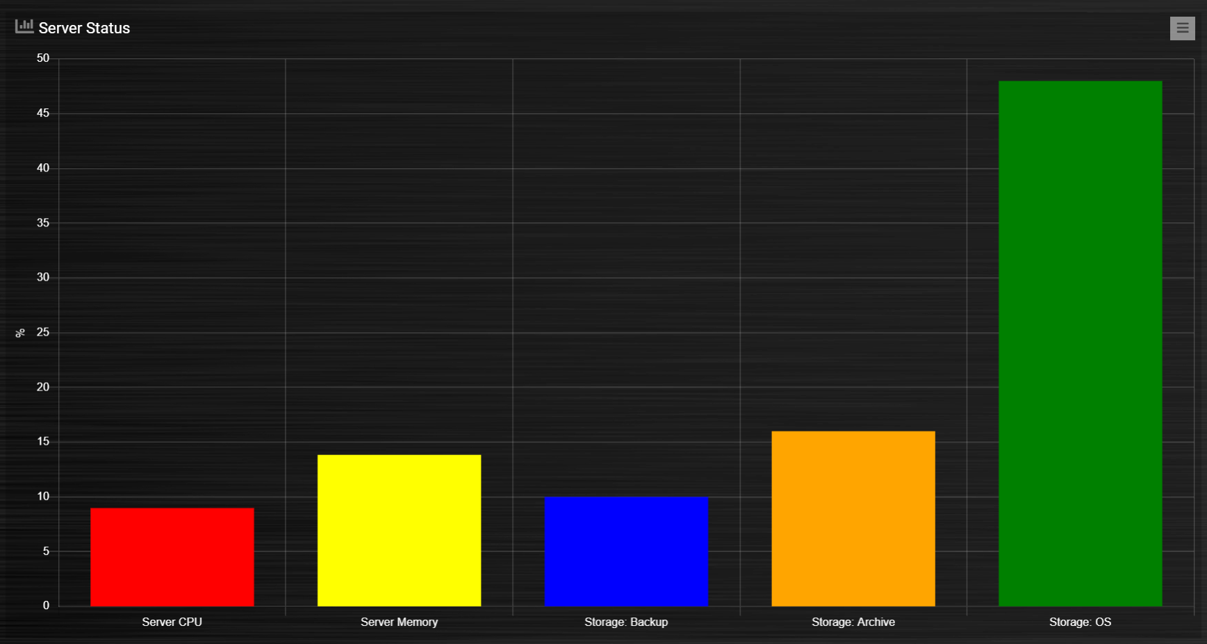
The feature works with device sensors such as counter, percentage and temperature.
With temperature sensors that have setpoints, it calculates whether the device is:
Cold - blue
At setpoint - orange
Hot - red
It will show a line displaying the SetPoint values in front of the bar graph for thermostat devices that have SetPoint data.
The tooltip will show the status and schedule with EvoHome devices.
The block datasetColors parameter can now be used to set the colors for ‘below temp’, ‘at temp’, ‘above temp’ and ‘setpoint’ (in that order).
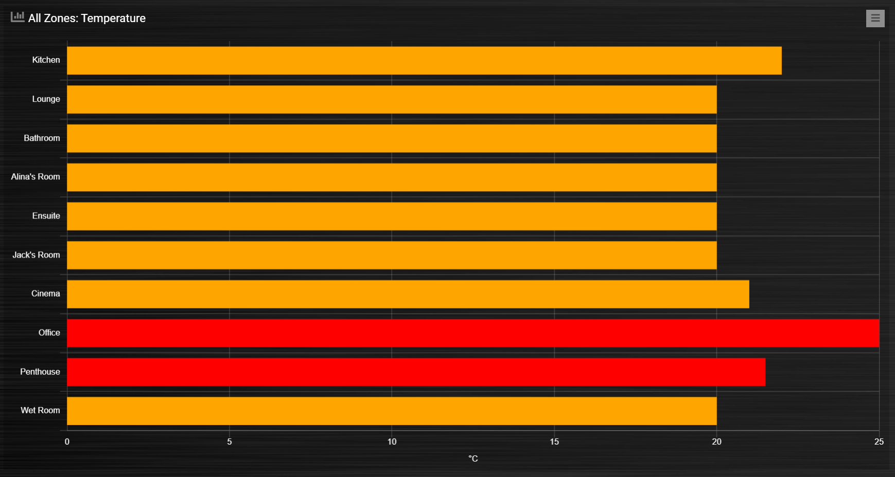
The office and kitchen rooms are showing red, as the temperature is above the setpoint …
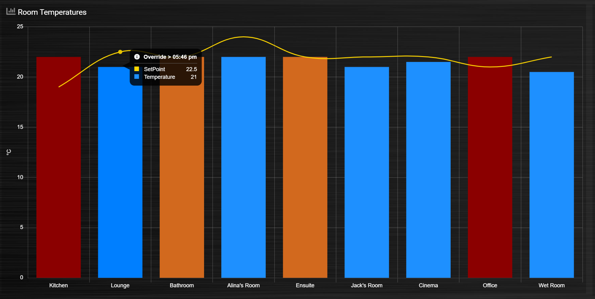
Setting groupByDevice to ‘horizontal’ shows like this …
blocks['all_zones'] = {
        title: 'Room Temperatures',
        devices: [6, 11, 12, 8, 14, 9, 15, 235, 10, 13],
        groupByDevice: 'horizontal',
        beginAtZero: true
}
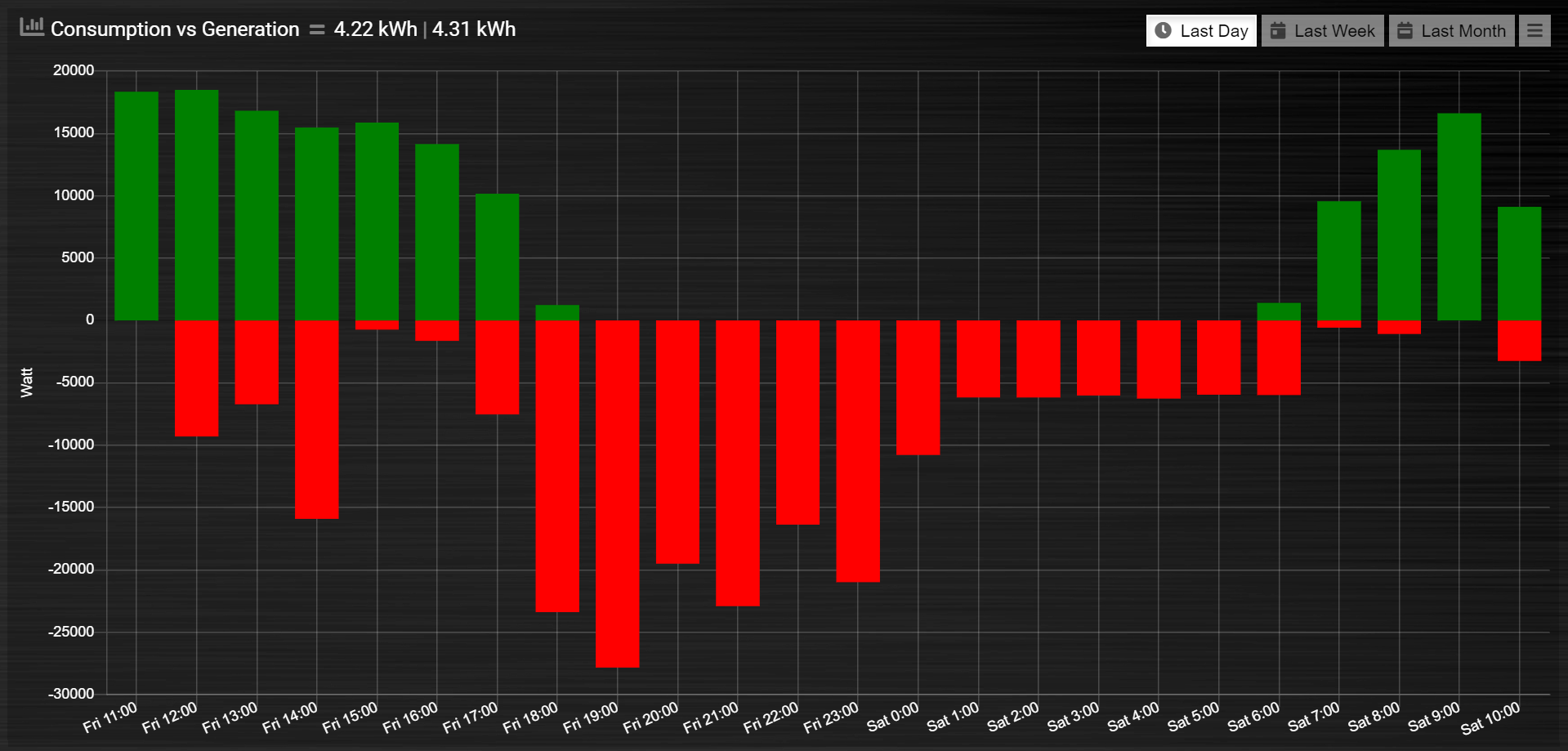
stacked
With stacked: true parameter graph bars wil be stacked. To show the total value of the stacked bars on the tooltip you have to add tooltiptotal: true to the graph block.
blocks['group_by_solar_vs_grid'] = {
        title: 'Consumption vs Generation',
        devices: [258,1],
        graph: 'bar',
        stacked: true,
        graphTypes: ['v'],
        tooltiptotal: true,
        debugButton: true,
        custom : {
        "Last Day": {
                        range: 'last',
                        groupBy: 'hour',
                        filter: '24 hours',
        data: {
                                Generation: 'd.v_1',
                                Consumption: 'd.v_258*-1'
        },
                },
                "Last Week": {
                        range: 'month',
                        groupBy: 'day',
                        filter: '7 days',
        data: {
                                Generation: 'd.v_1',
                                Consumption: 'd.v_258*-1'
        },
        },
        "Last Month": {
                        range: 'month',
                        groupBy: 'week',
        data: {
                                Generation: 'd.v_1',
                                Consumption: 'd.v_258*-1'
        },
        }
        },
        lineTension: 0.5,
        datasetColors: ['green', 'red']
}
tooltiptotal
tooltiptotal: false
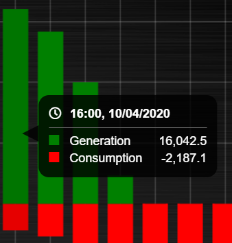
tooltiptotal: true
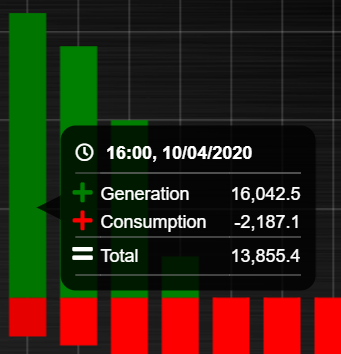
tooltiptotal: ['Confirmed (Total)', 'Deaths (Total)']
Basically, if you specify an array, it will only total those datasets, and ignore the other ones. Anything that is being totalled will show a “+” icon.
Defined Popups
Popups can be defined by adding a new block parameter, “popup”, to the block that popup is for. This allows the popup to use all the block parameters that a graph block does, allowing them to style the graph however they want. It also means the legend and tooltips can display custom names (instead of the key names). For example, the user has an Energy meter block defined as follows:
blocks[258] = {
        title: 'Consumption',
        flash: 500,
        width: 4,
        popup: 'popup_consumption'
}
In this example, they have specified that the popup will use a defined graph called ‘popup_consumption’ instead of the default popup. This defined graph is then added to the config.js just like a normal graph:
blocks['popup_consumption'] = {
        title: 'Energy Consumption Popup',
        devices: [258],
        toolTipStyle: true,
        datasetColors: ['red', 'yellow'],
        graph: 'line',
        legend: {
        'v_258' : 'Usage',
        'c_258' : 'Total'
        }
}
Examples
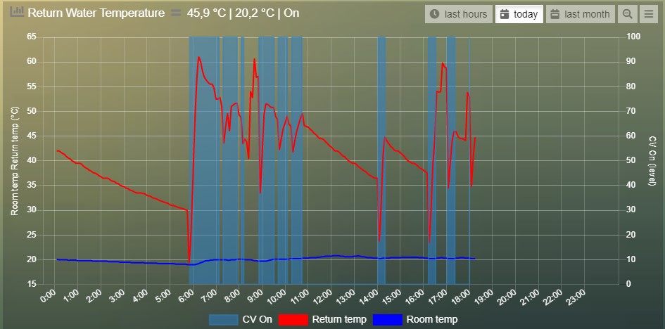
Combine two temperature devices with the switch info indicating central heating is on
blocks['switchgraph'] = {
        devices: [
                31,
                27,
                17,
        ],
        debugButton: true,
        zoom: true,
        graph: 'line',
        legend : {
                l_17: 'CV On',
                te_31: 'Return temp',
                te_27: 'Room temp'
        },
        lineFill: [true, false, false],
        datasetColors: ['rgba(44,130,201,0.5)', 'red', 'blue'],
}
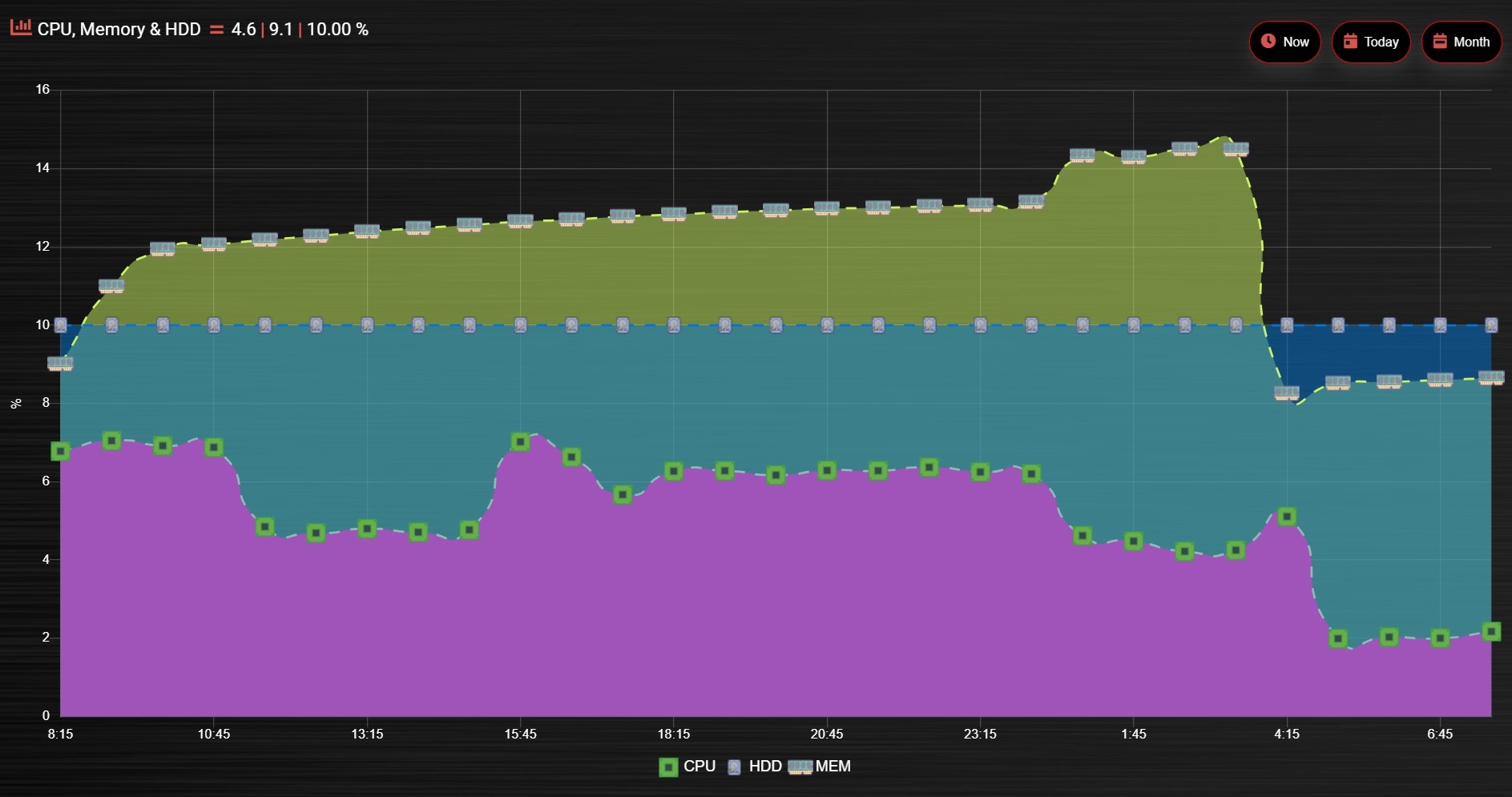
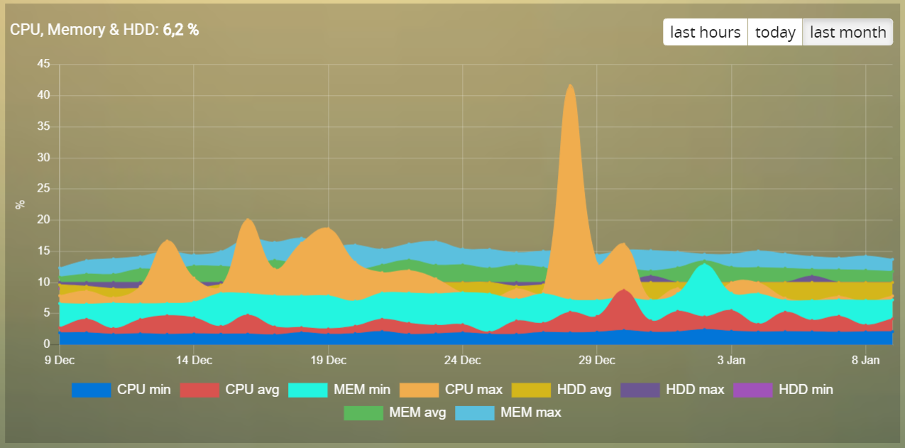
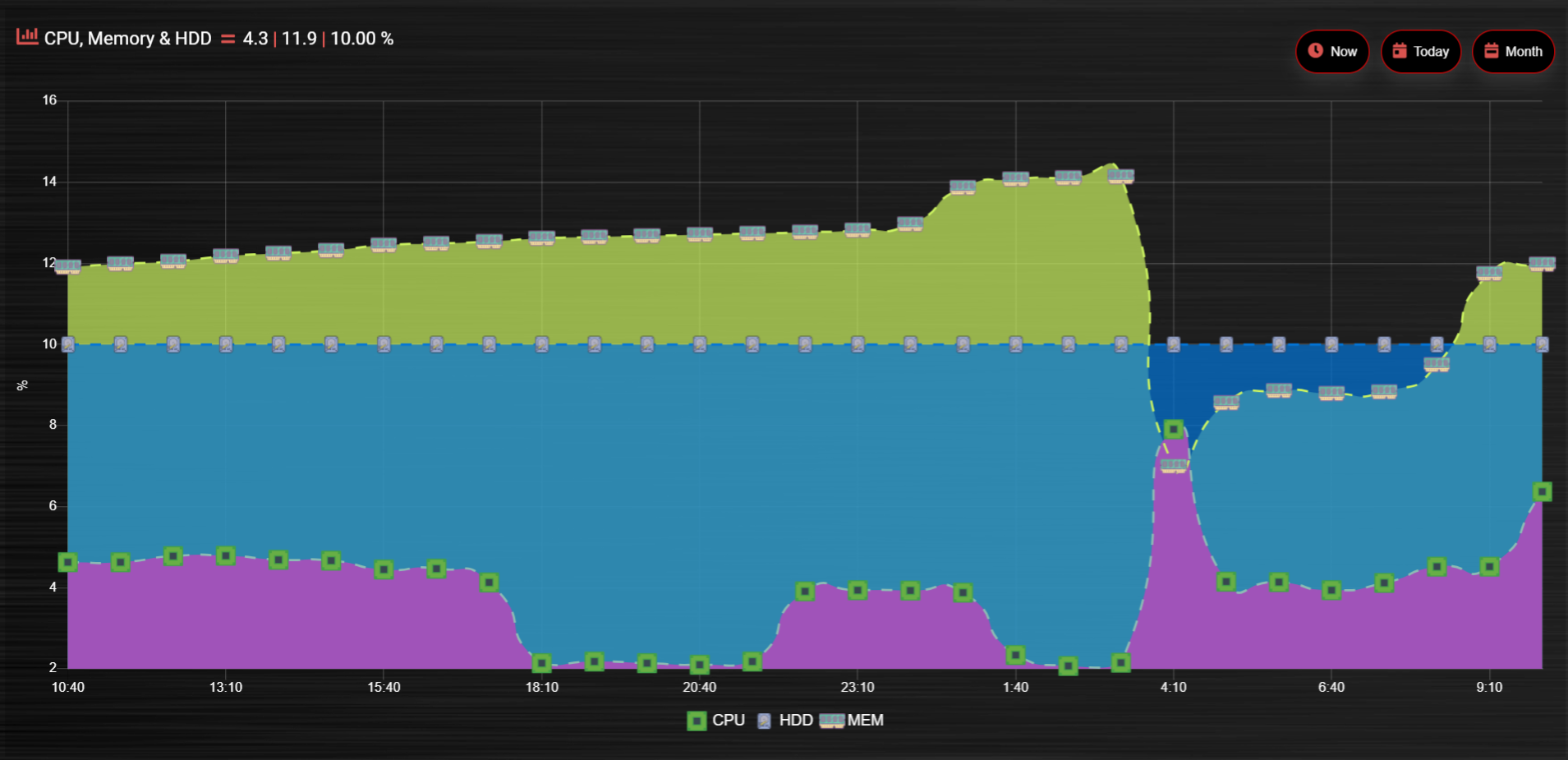
CPU, Memory & HDD
blocks['multigraph_17'] = {
        title: 'CPU, Memory & HDD',
        devices: [ 17, 18, 189 ],
        datasetColors: ['Red', 'Orange', 'Blue', 'Green', 'LightBlue', 'Aqua', 'Yellow', 'Purple', 'Pink'],
        legend: true,
        cartesian : 'linear',
        graph: 'line',
        lineFill: true,
        drawOrderDay:   ['v_17', 'v_189', 'v_18'],
        drawOrderMonth: ['v_min_17', 'v_avg_17', 'v_min_18', 'v_max_17', 'v_avg_189', 'v_max_189', 'v_min_189', 'v_avg_18', 'v_max_18'],
        legend: {
                'v_17'          : 'CPU',
                'v_avg_17'      : 'CPU avg',
                'v_max_17'      : 'CPU max',
                'v_min_17'      : 'CPU min',
                'v_18'          : 'MEM',
                'v_avg_18'      : 'MEM avg',
                'v_max_18'      : 'MEM max',
                'v_min_18'      : 'MEM min',
                'v_189'         : 'HDD',
                'v_avg_189'     : 'HDD avg',
                'v_max_189'     : 'HDD max',
                'v_min_189'     : 'HDD min'
        }
}
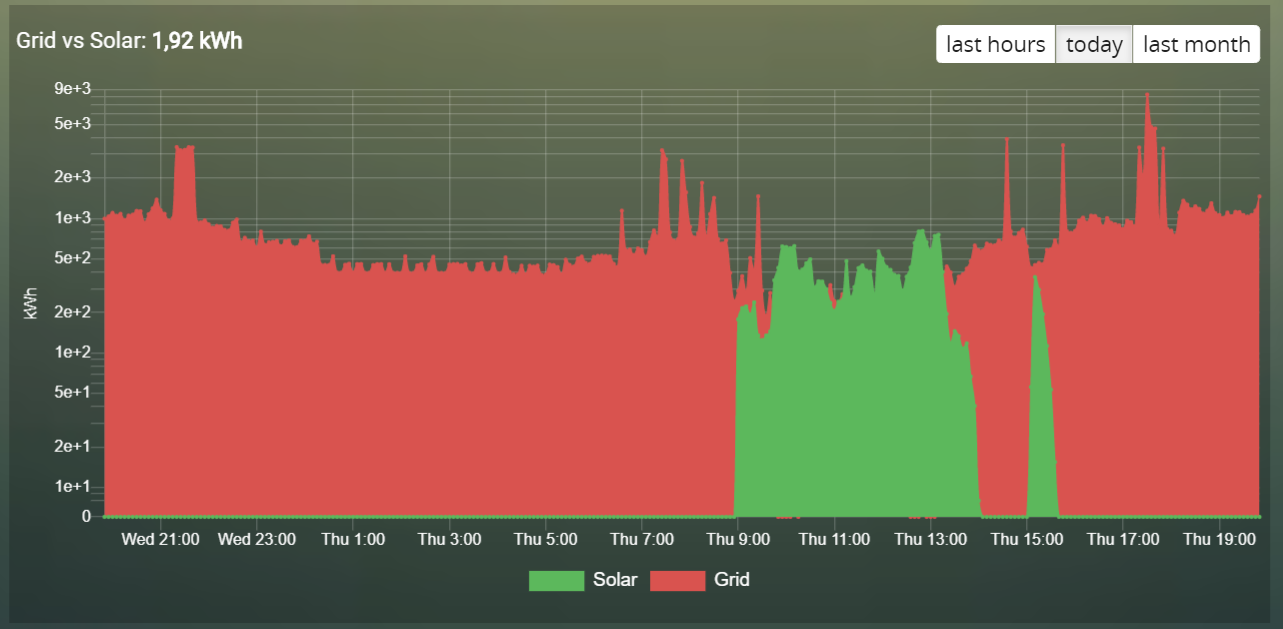
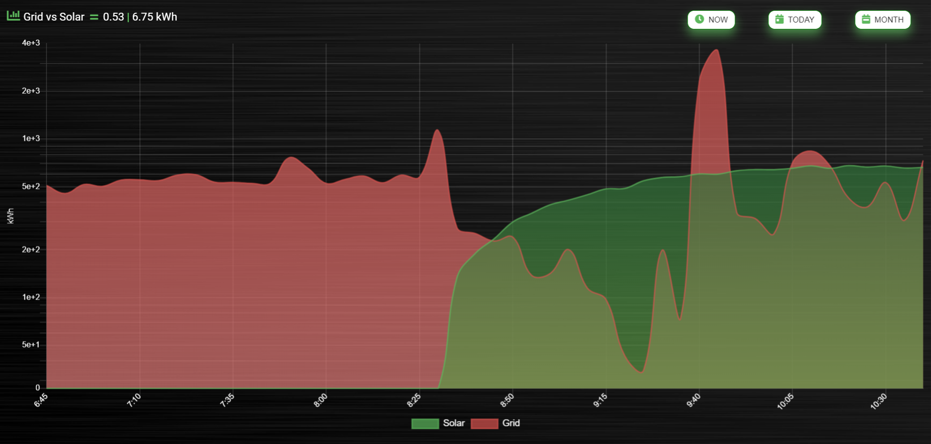
Grid vs Solar
Due to the low solar output in winter months, comparing solar to grid was often hard to read. The graph needed to be updated to use a logarithmic scale, i.e. a nonlinear scale useful when analysing data with large ranges. The solar device stops recording data at the usual 5 minute intervals when it gets dark. The code inserts intervals (with a value of 0.00) when no data is recorded. In the updated multigraph block below, the cartesian property is used, and three drawOrder properties.
blocks['multigraph_1'] = {
        title: 'Grid vs Solar',
        devices: [ 162, 1],
        datasetColors: ['Red', 'Green'],
        lineFill: [true, true],
        graph: 'line',
        cartesian: 'logarithmic',
        drawOrderLast: ['v_1', 'v_162'],
        drawOrderDay: ['v_1', 'v_162'],
        drawOrderMonth: ['v_162', 'v_1', 'c_162', 'c_1'],
        legend: {
                'v_162': 'Grid',
                'v_1': 'Solar',
                'c_162': 'Solar Cumulative',
                'c_1': 'Solar Cumulative'
        }
}
This is using the standard linear scale (i.e. cartesian = linear):
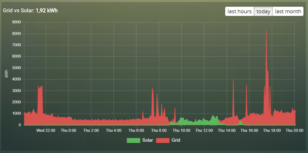
This is using the new logarithmic scale (i.e. cartesian = logarithmic). Note the y axis labelling on the left:
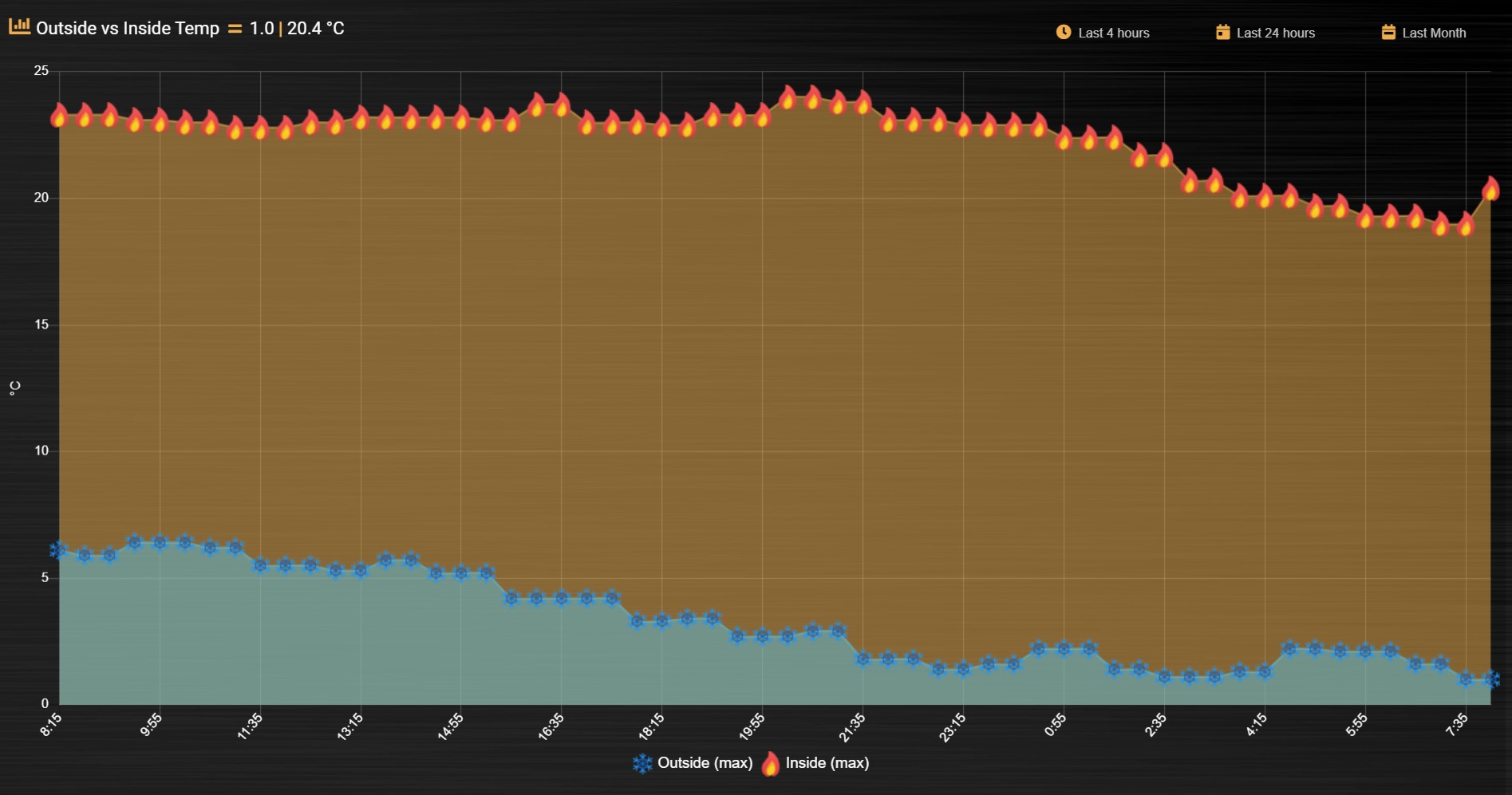
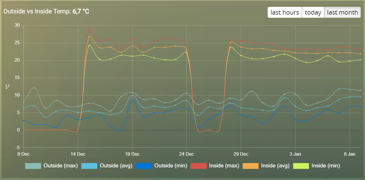
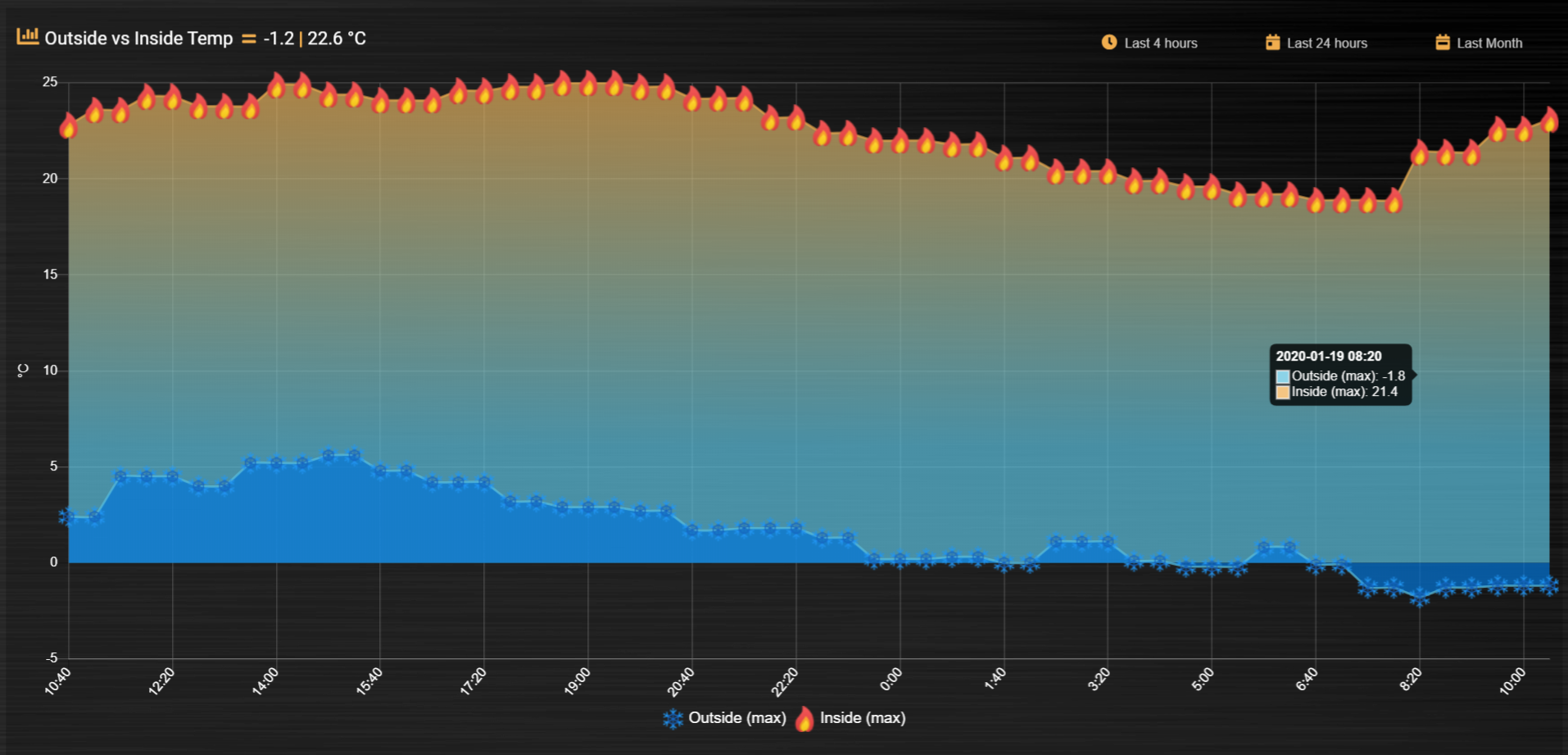
Outside vs Inside Temp
The indoor temp sensor also includes barometric pressure (ba) and humidity (hu), but the outside one is only temperature. In the graph below, the graphTypes property is used to remove the extra unwanted data. Now only the temperature is directly compared.
blocks['multigraph_72'] = {
        title: 'Outside vs Inside Temp',
        devices: [ 72, 152],
        datasetColors: ['LightBlue', 'LightGrey', 'Blue', 'Orange', 'Red', 'Yellow'],
        graphTypes: ['te','ta','tm'],
        graph: 'line',
        legend: {
                'te_72': 'Outside (max)',
                'ta_72': 'Outside (avg)',
                'tm_72': 'Outside (min)',
                'te_152': 'Inside (max)',
                'ta_152': 'Inside (avg)',
                'tm_152': 'Inside (min)'
        }
}
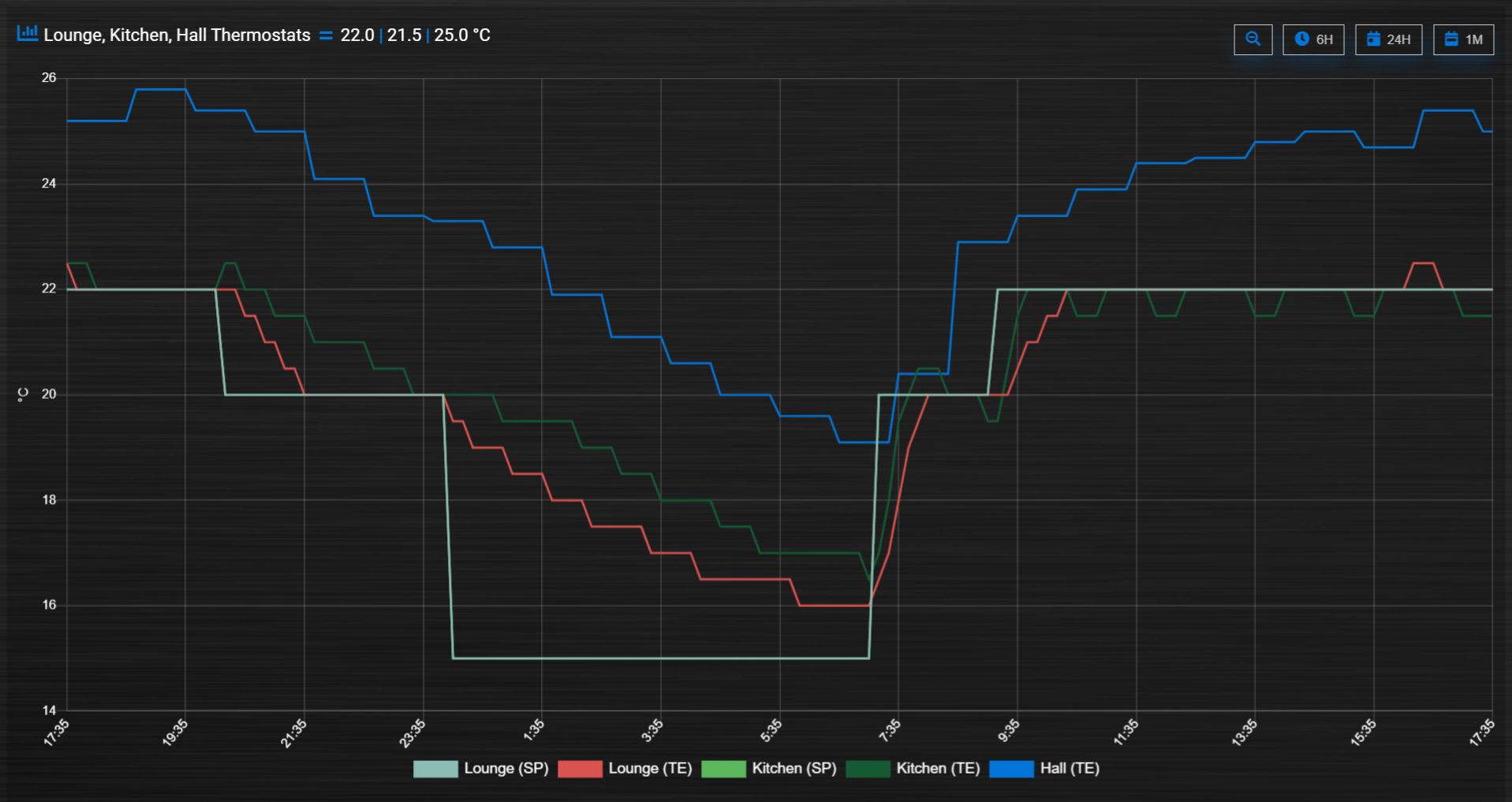
Temperature and Setpoint
Three thermostat devices (Evohome TRVs), each showing their temperature and setpoint.:
blocks['evohome_graphs'] = {
        title: 'Lounge, Kitchen, Hall Thermostats',
        devices: [ 11, 12, 152],
        interval: 2,
        maxTicksLimit: 12,
        datasetColors: ['LightGrey', 'Red', 'Green', 'DarkGreen', 'Blue'],
        buttonsIcon: 'Purple',
        graph: 'line',
        lineTension: 0,
        borderWidth: 2,
        spanGaps: false,
        graphTypes: ['te', 'se'],
        buttonsBorder: '#ccc',
        buttonsColor: '#ccc',
        buttonsFill: 'transparent',
        buttonsIcon: 'Blue',
        buttonsPadX: 10,
        buttonsPadY: 5,
        buttonsMarginX: 5,
        buttonsMarginY: 2,
        buttonsRadius: 0,
        buttonsShadow: 'rgba(2, 117, 216, 0.2)',
        buttonsSize: 12,
        buttonsText: ['6H', '24H', '1M'],
        legend: {
                'se_11': 'Lounge (SP)',
                'sm_11': 'Lounge (SP Min)',
                'sx_11': 'Lounge (SP Max)',
                'te_11': 'Lounge (TE)',
                'ta_11': 'Lounge (TE Avg)',
                'tm_11': 'Lounge (TE Min)',
                'se_12': 'Kitchen (SP)',
                'sm_12': 'Kitchen (SP Min)',
                'sx_12': 'Kitchen (SP Max)',
                'te_12': 'Kitchen (TE)',
                'ta_12': 'Kitchen (TE Avg)',
                'tm_12': 'Kitchen (TE Min)',
                'se_152': 'Hall (SP)',
                'sm_152': 'Hall (SP Min)',
                'sx_152': 'Hall (SP Max)',
                'te_152': 'Hall (TE)',
                'ta_152': 'Hall (TE Avg)',
                'tm_152': 'Hall (TE Min)'
        }
}
Buttons
Standard buttons:
Updated buttons (one of many styles):


More Examples
This graph includes 2 separate temperature sensors, with gradients, custom points (images) and button styling:
This graph includes 3 separate percentage sensors, custom points (images) and button styling:
This graph includes 2 separate energy sensors, subtle gradients, no points and uses the logarithmic scale:
This graph includes 2 separate counter sensors, without gradients, but with custom points (images) and button styling:
This graph uses 2 temperature sensors and custom data, calculating a 3rd virtual dataset, showing the difference between the outside temperature and the inside temperature:
Number format
Number formatting is applied to tooltip values and header values.
Number formatting uses two global config parameters:
_DECIMAL_POINT: Default value is','_THOUSAND_SEPARATOR: Default value is'.'
You can redefine these two config parameters in CONFIG.js:
_DECIMAL_POINT = '.';
_THOUSAND_SEPARATOR = ',';
For header values the formatting is only applied in case the block parameter format is set to true, and the device is a single value device.
For instance, for a TempHumBar device no formatting will be applied to header values.
For header values the default number of decimals is derived from the device type. You can overrule the number of decimals with the decimals block parameter.
For tooltip values the default number of decimals is the decimals value of the first device, which may be overruled by the decimals parameter.
The values in a tooltip will always have the same number of decimals.
Styling
For graphs the following css-classes are used:
.graphheader: The graph header, including title and buttons
.graphtitle: The title of the graph, including the current value
.graphbuttons: The buttons for the graph
You can modify the class definition in custom.css. If you want to hide the header:
.graphheader {
  display: none;
}
You can also modify the class for a specific graph only
[data-id='mygraph'].graph .graphheader {
  display: none;
}
In the previous example only the graph created with key ‘mygraph’ will be affected.
To change the default size of the graph popup windows add the following style blocks to your custom.css:
.graphheight {
  height: 400px;
}

.graphwidth {
  width: 400px;
}
To remove the close button of the graph popup add the following text to custom.css:
.graphclose { display: none; }
To be detailed…
.opengraph, .opengraph<idx>p, #opengraph<idx>p   //classes attached to the graph popup dialog
.graphcurrent<idx>      //class attached to the div with the current value
For internal use:
block_graph_<idx>     //The div to which the graph needs to be attached.
#graphoutput<idx>     //The canvas for the graph output
Styling of X- and Y- axes
(advanced customization…)
By setting the options block parameter most graph properties can be customized.
For instance to change the font size of the axes, and reduce the width of the graph legend use the following block definition:
    blocks['graph_43'] = {
            ...,
            options: {
        scales: {
            xAxes: [{
                   ticks: {
                    fontSize: 7
                   }
            }],
            yAxes: [{
                ticks: {
                 fontSize: 7,
                },
                scaleLabel: {
                    fontSize: 7
                }
            }],
        },
        legend:{
            labels:{
                fontSize:10,
                boxWidth:10
            },
        }
    }

}
Dashticz uses chartjs version 2.9. Most configuration options can be found via https://www.chartjs.org/docs/2.9.4/, or post your question in the forum.
Debug
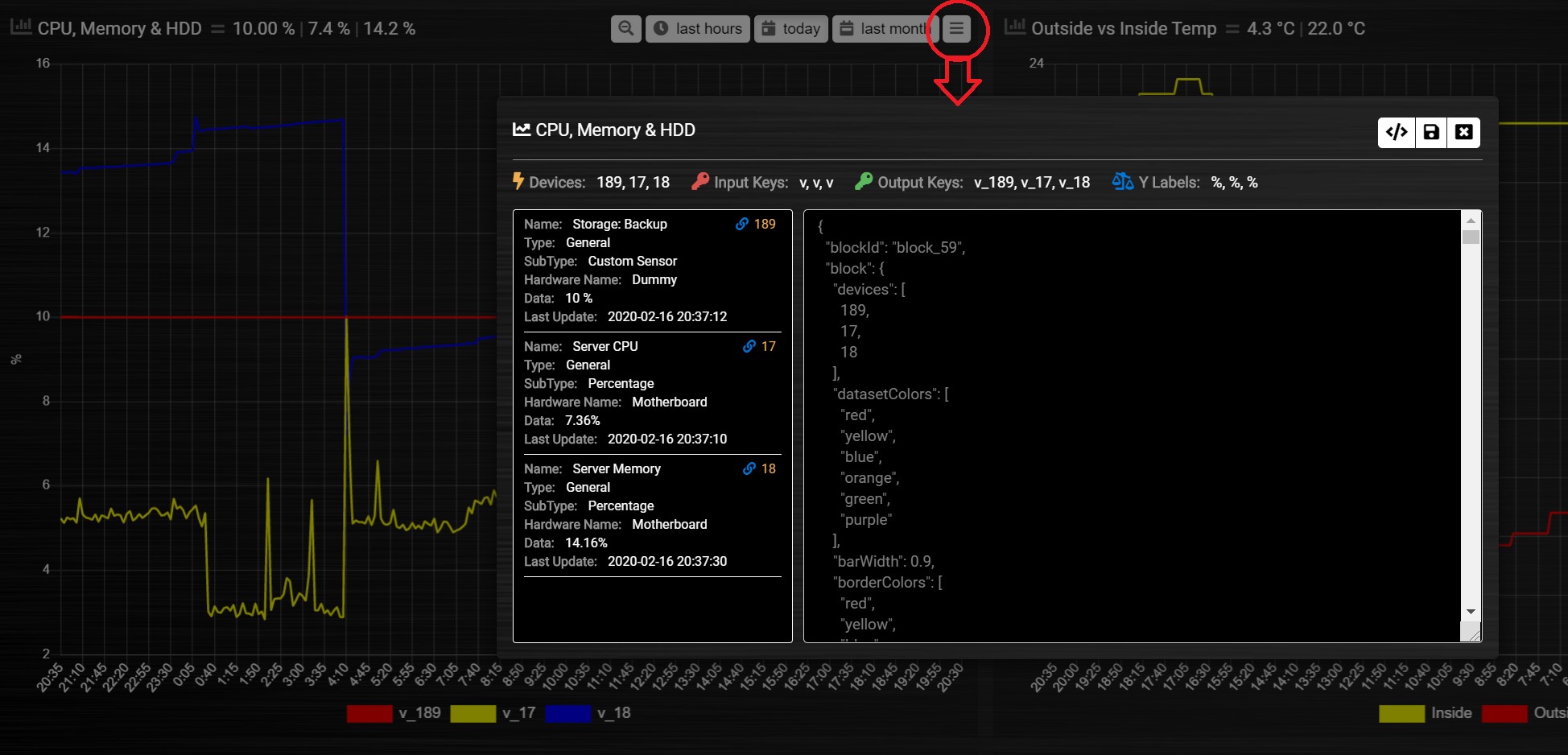
debugButton: true adds a button to the top right of the graph. When pressed, a dialog box is displayed with key information about each device and the data that has been generated to show the graph. Each device has a link, this takes you to page showing all data about each device within the graph, using Domoticz api. Across the top shows the original keys and the new keys (appended with the device idx).
There are 3 buttons at the top of the debug window:
DevTools button - press F12 on the keyboard and then click this to show the graph properties in Dev Tools
Save button - click this to download your graph properties in JSON format. This will be helpful if you need support.
Close button - to exit the debug window. Although clicking outside of the window does the same thing.