Styling via custom.css
Note
In Dashticz v3.2.0 the css-classes for most of the special blocks have been updated. See Special blocks
Almost all visual elements on the Dashticz dashboard are styled via so called style sheets. Normally the abbreviation CSS (Cascading Style Sheets) is used for this.
The source files that define the style information also have the .css extension.
There are a lot of creative users on the Domoticz Forum, that modify the CSS. A lot of examples can be found on the forum. Some examples will be summarized here, which you can use as a starting point to customize your own dashboard.
The default styling is defined in the file <dashticz>/css/creative.css. While you can use this file for inspiration, you should not modify it,
since the default styling can be modified in the file custom.css, located in the folder <dashticz v3>/custom
TIP: Comments can be used to explain the code, and may help when you edit the source code at a later date.
A CSS comment starts with /* and ends with */. Comments can also span multiple lines:
/* This is a single-line comment */
This sections has some examples of CSS that can be placed in custom.css, so you can create your own look and feel.
Introduction into CSS
A lot of CSS tutorials are available online. The first google result: https://www.w3schools.com/css/
A CSS style definition consists of two parts.
Selector
Style modifier
With the selector part you select certain elements on the Dashboard. With the style modifier part the visual appearance can be defined.
Almost all Dashticz elements on the dashboard have one or more class definitions associated with it.
For instance most blocks have the class transbg associated with it. As an example, You can use this class name to change the background colors for all blocks at once.
Add the following to custom.css:
.transbg {
 background-color: red !important;
}
In this example the selector element is .transbg. With this selector all elements with the class transbg are selected.
On the selection we apply a new background-color style.
In some cases, also in the example above, the statement !important needs to be added, to enforce that this style setting will overrule other style settings that have been defined by other style modifiers.
If you want to change only the background of one specific block you have to narrow the selector. For this you can use the data-id parameter.
All blocks that you have defined with blocks[idx] will have the data-id parameter with value 'idx' attached to it:
[data-id='120']  {
 background-color: red !important;
}

[data-id='120']  {
 background-color: red !important;
}
All blocks on the dashboard have a unique id, which are sequentially numbered. How to find the block id will be explained later. Assuming the block you want to change has block id 3 then add the following to custom.css:
#block_3 .transbg {
 background-color: red !important;
}
This means: Change the background color to red for the elements with the class transbg associated with it within the block with the id block_3.
So remember, blocks can have classes, parameters and id’s associated with them. Blocks are selected by choosing the right class, parameter, and/or id.
If you right-click on a block, and select Inspect you can see the assigned classes in DevTools.
Domoticz blocks
Used classes for Domoticz blocks
Example block definition:
blocks[120] = {
  width: 6
}
Placed in a column it can give the following result:
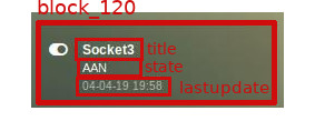
The whole block has class block_120
First line: title
Second line: state
Third line: lastupdate
Besides the specific block label .block_120 the whole block will also contain the generic css class label .mh.
In case the Domoticz device contains subdevices, like a TempHumBar device, three devices will be created.
In this case instead of .block_120 the labels .block_120_1, .block_120_2` and ``.block_120_3 will be used.
If you have used a specific blocks key in combination with the idx parameter, the key label will be used as CSS class label as well, like this:
blocks['mydevice'] = {
  idx: 120,
  width: 6
}
This block will have the CSS class label .block_mydevice. Again, if device 120 has subdevices, the following CSS classes will be assigned:
.block_mydevice_1, .block_mydevice_2 and .block_mydevice_3.
Last variation: A specific blocks key in combination with a specific subdevice:
blocks['mydevice'] = {
  idx: '120_2',
  width: 6
}
This block will have the CSS class label .block_mydevice
Background color
To change the background color of all Domoticz blocks:
div[class*='block_'] {
  background-color: red !important;
}
To change the height of only this block:
.block_120 {
  height: 150px !important;
}
Styling of lastupdate text
To change the font-size and color of the lastupdate text of this block:
.block_120 .lastupdate {
  font-size: 20px;
  color: blue;
}
Icon colors of a Domoticz switch
To change the icon colors for only this block:
.block_120 .on {
  color:#F1C300;
}

.block_120 .off {
  color:#fff;
}
In the previous example you can see the on class or off class can be used to select a block depending on the state of the Domoticz device.
Special blocks
CSS class definition for special blocks
The CSS class approach for special blocks are slightly different as the Domoticz blocks. Also not all special blocks have been transformed to this template yet. It’s applicable to the following blocks:
alarmmeldingen, blocktitle, button, calendar, camera, coronavirus, dial, frame, graph, longfonds, news, nzbget, publictransport, secpanel, stationclock, streamplayer, traffic, trafficinfo
Currently it’s not applicable to:
coins, garbage, sonarr, spotify, weather_owm, weather
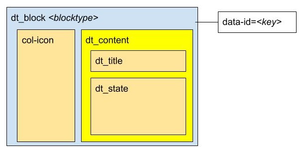
Each top level block has the class dt_block and the name of block type as class assigned.
If you have defined this block via blocks['mykey']=... then the value of the data-id parameter will be set to 'mykey'.
If you have defined the block by using an object, like buttons.buienradar= then
you can define the key by making use of the key-parameter in your block definition.
So if you want to select all blocktitles, add the following to custom.css:
.blocktitle {
    background: blue !important;
}
If you want to change the title part of all blocktitles:
.blocktitle .dt_title {
    font-size: 50px;
    color: red;
}
If you want to change only a specific blocktitle:
[data-id='title1'].blocktitle {
    background: yellow !important;
}
Block titles
Example block definition:
blocks['myblocktitle'] = {
  type: 'blocktitle',
  title: 'My Devices Block'
}
To select all the blocktitles and change the background color:
.blocktitle {background-color: gray !important;}
To change the background color for only this block title:
.dt_block[data-id='myblocktitle'] {background-color: gray !important;}
As you can see in the previous example we use the generic block selector dt_block
having the value myblocktitle for the parameter data-id. This is the generic way to select a specific special block.
Font Size
To change the font size of this block title:
.dt_block[data-id='myblocktitle'] .dt_title {
  font-size: 30px;
}
Smaller Title blocks (Height)
.blocktitle {
    height: 60px !important;                /* default height=75px */
    padding-top: 3px !important;                    /* center text for new height */
}
Icons
Larger (Bulb) icons
.far.fa-lightbulb:before{
    font-size: 24px;
}

.fas.fa-lightbulb:before{
    font-size: 24px;
}
All Icons on the Dashboard Larger
To make all icons on the Dashboard larger in one move, just simple add (choose font-size wisely!!):
.far,.fas,.wi {
   font-size:24px !important;
}
Fonts & Text Size
Change font size of 1 specific (text) device
Every block has an unique identifier-classname, which look something like ‘’’.block_xxx’’’ (where xxx is the idx of your choice) that can be used in css. Example:
.block_233 {
   font-size:120px !important;
   color:red !important;
}
Change font size of public transport module
.publictransport div {
    font-size: 13px;
}
Fontsize Trashcan Module
.trash .state div.trashrow {
    font-size: 12px;
}

.trash .state div.trashtoday {
    font-size: 16px;
}

.trash .state div.trashtomorrow {
    font-size: 14px;
}
Color & Transparancy
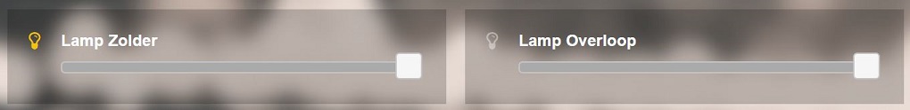
Colored Lightbulbs
It is possible to use colors for the bulb-icons.
In custom.css add something like:
.fas.fa-lightbulb {
   color:#F1C300;
}
.far.fa-lightbulb {
   color:#fff;
}
Result:
Lightbulbs color & Opacity
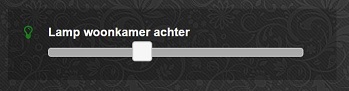
Color: green
Opacity: 0.4
.fas.fa-lightbulb {
    color: rgba(0,255,0,0.4)
}
Miscellaneous
Hide block
div[data-id='myblock'] {
   display: none
}
Change 'myblock' to your own block name
Remove Swiper Pagination Bullet
.swiper-pagination-bullet {
    display: none !important
}
Remove break line
.block_107 br:nth-child(2) {
   display: none
}
Change 107 to your own block number
Customized drop down block
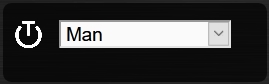
.block_438 .icon {
   width: 85%;
   height: auto;
}
.block_438 .title,
.block_438 br:nth-child(2) {
      display: none;
}
.block_438 .col-data select {
   font-size: 150%;
   width: 100%;
   background-color: rgb(242,242,242);
}
Change 438 to your own block number
Change size and color of Standby Screen items
.standby .clock{
   font-size:250px !important;
   color: #718084!important;
}
.standby .weekday,
.standby .date {
   font-size:80px !important;
   color: #4E585B !important;
}
Prevent click handling of a block
For some blocks you may want to disable click handling, for instance for the news block, or for the frame content. This section describes how this may be achieved.
Assume you’ve defined your block in CONFIG.js via:
blocks['news'] = {
    ...
}
then you can disable handling of click events by adding the following to custom.css:
[data-id="news"].dt_block {
    pointer-events: none
}
or, add the addClass block parameter:
blocks['news'] = {
   addClass: 'noclick',
   ....
}
and add the following to custom.css:
.noclick {
  pointer-events: none
}
Both methods also work for frames.
Popup windows
Popup windows have the following class attached to it: modal-dialog-custom.
The popup window contains a div with the class modal-content. Depending on the popup type, the following classes will be applied as well:
modal-urlFor an url opened in a popup windowmodal-graphFor a graph opened in a popup windowmodal-popupFor a popup created from thepopupblock parameter, except when thepopupparameter refers to a graph block. In the latter case, themodal-graphparameter will be applied.
A modal-url popup window, will have a white background, white border, and black ‘close’ button.
The other popup windows will have a black background, and a white ‘close’ button.
The default styling is a black background, with white ‘close’ button.
As an example, to give url-popups a green backgrond with a red close button:
.modal-content.modal-url {
   background-color: green
}

.modal-content.modal-url .close {
   color: red;
   opacity: 1;
}